November 14, 2026 / Brand Strategy
Different Game Art Styles: A Practical Production Guide
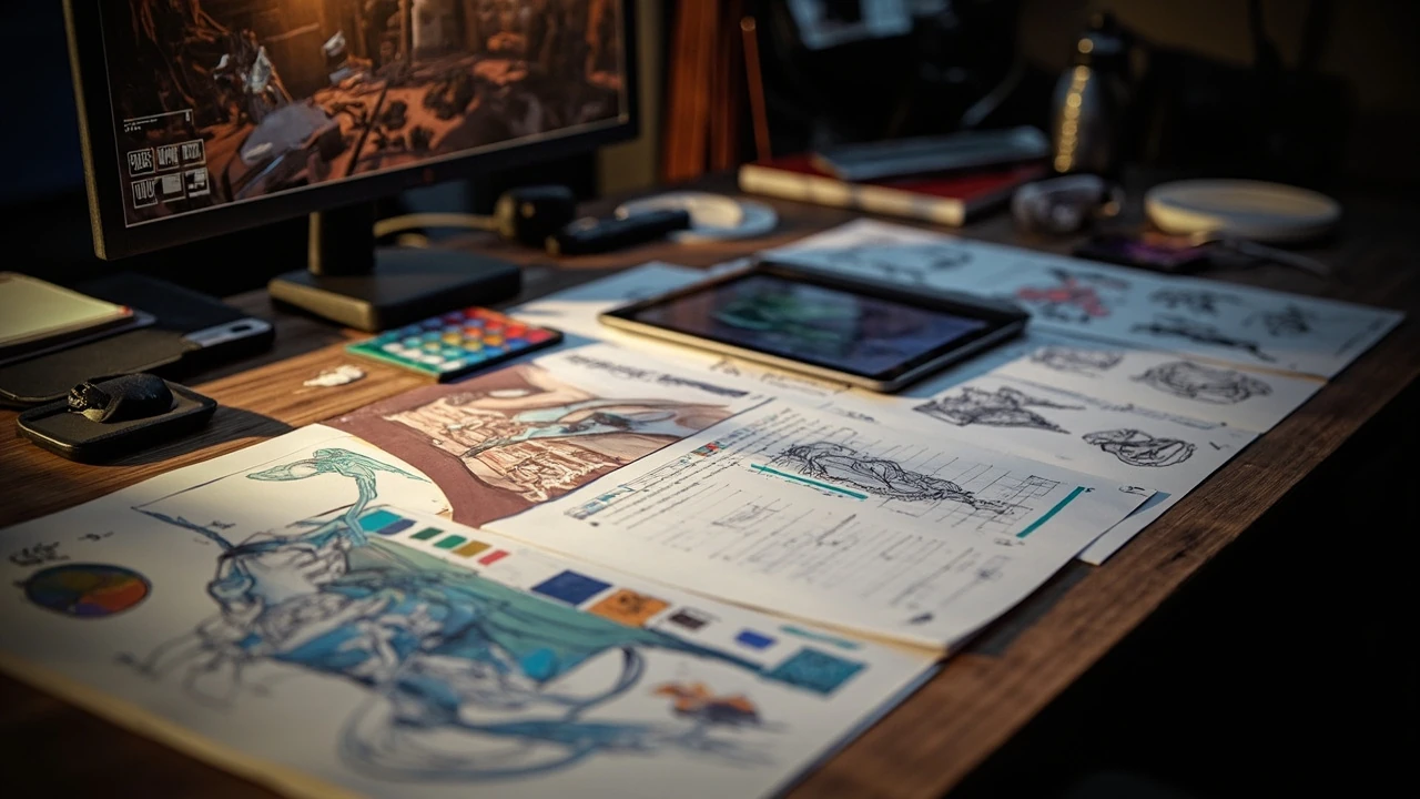
Different game art styles and the choices behind them
A convincing game does not need the most detailed assets or the highest resolution textures. It needs visual decisions that support the intended play, communicate the right tone, and remain buildable by the team. Choosing among different game art styles becomes much easier when the team defines what the player should notice, understand, and feel before choosing a rendering method.
The most useful art direction begins with function. A survival game may need a restrained palette that makes resources readable, while a story-heavy adventure may benefit from painterly lighting and exaggerated silhouettes. A team can combine methods, but the combination needs a shared rule. Without that rule, attractive assets can accumulate into an inconsistent world that obscures gameplay.
This guide compares the major visual directions used in game production. It covers how to choose one, where a hybrid makes sense, what each style demands from artists and technical staff, and how to test whether a direction is ready for production. For a broader introduction to common aesthetics, What’s Your Game Art Style? Aesthetics Every Artist Should Know offers a useful reference for recognizing the main categories.
How to choose an art style for a game
Choose a style by matching visual language to player expectations, not by selecting the most fashionable technique. The best direction answers three questions: what information must the player read quickly, what mood should the world communicate, and what level of production investment can the team sustain?
Begin with the player-facing purpose of the image. A weapon silhouette must communicate its use, a quest marker must remain legible against several environments, and a character needs enough shape and color information to be recognized from a distance. Decoration comes after those requirements are met.
Then evaluate four production factors:
- Readability: Can the player separate characters, interactables, hazards, and background information under expected viewing conditions?
- Consistency: Do materials, lighting, proportions, color, and detail follow the same authored rules across the project?
- Performance: Can the intended assets meet the platform, hardware, frame-time, memory, and loading requirements?
- Pipeline: Can the team create, revise, rig, animate, light, texture, optimize, and ship these assets within its schedule?
A useful art brief names the style, the player experience, the camera distance, the production constraints, and examples of what the team should emulate. It should also define what is out of scope. “Painterly fantasy” alone is too vague. A stronger brief states the level of surface detail, the lighting behavior, the color structure, the character proportions, and the kinds of camera and animation the system must support.
| Decision | Primary question | Evidence to review | Common warning sign |
|---|---|---|---|
| Visual readability | Can players identify important elements quickly? | Gameplay captures at the intended camera distance | Attractive detail competes with objectives |
| Style consistency | Do all assets appear to share one visual grammar? | Side-by-side environment, character, and prop reviews | Each specialist introduces a different material or proportion system |
| Technical fit | Can the style work within the rendering and performance budget? | Representative scene in the target engine and build | The mood depends on an effect that cannot scale |
| Production fit | Can the team maintain the style after the first polished assets? | Asset estimates, style guide, and repeatable source files | Hero assets look strong but routine assets are undecided |
A comparison of common game art directions
Game art styles are best understood as combinations of shape, material, color, light, texture, and rendering behavior. A label such as “realistic” or “cartoon” describes a visual direction, while “cel-shaded,” “hand-painted,” or “pixel art” can also identify a production method. Confusing those levels can lead a team to choose a term before it understands the desired result.
| Style | Defining visual traits | Best suited to | Production challenge | Common hybrid |
|---|---|---|---|---|
| Realism | Physically familiar materials, lighting, scale, and detail | Simulation, grounded narratives, environmental storytelling | Asset variation, material control, lighting, and performance | Realism with selective stylization |
| Stylized realism | Believable space and light with controlled exaggeration | Grounded fantasy, cinematic adventures, character-led games | Keeping believable foundations while preserving a recognizable identity | Realistic rendering with graphic shapes |
| Cartoon | Exaggerated proportions, smooth forms, bright readable color | Family games, platformers, action games with broad audiences | Expressive animation and avoiding generic character shapes | Cartoon forms with painterly surfaces |
| Cel-shaded | Discrete light and shadow bands, graphic outlines, modeled volume | Comic adaptations, fighting games, distinctive 3D worlds | Outline consistency and transitions between lighting states | Cel shading with realistic proportions |
| Low-poly | Faceted geometry, simple textures, deliberate geometric clarity | Stylized adventures, strategy, performance-conscious 3D | Using geometry and composition instead of relying on texture detail | Low-poly forms with rich lighting |
| Hand-drawn | Visible brush, ink, or watercolor character; expressive shading | Storytelling, atmospheric adventures, 2D games | Consistent illustration across moving and interactive elements | Hand-painted characters in rendered spaces |
| Pixel art | Restricted resolution, deliberate clusters, limited animation frames | Retro-inspired games, compact action, games built around pixel simulation | Pixel consistency, animation timing, and scalable assets | Pixel characters in low-resolution 3D spaces |
| Monochromatic | Restricted palette with contrast, light, and atmosphere carrying hierarchy | Atmospheric horror, stealth, narrative games | Creating enough separation without introducing uncontrolled accent colors | Limited palette with selective gameplay accents |
| Isometric or 2.5D | Fixed or constrained perspective, consistent scale, layered depth | Strategy, simulation, dungeon crawlers, readable tactical play | Occlusion, camera transitions, depth communication, and asset reuse | 3D production with 2D-style composition |
Realism and stylized realism
Realism aims to reproduce familiar physical behavior, lighting, and material response. It is demanding because viewers recognize errors immediately. Scale, wear, weight, and lighting must agree, and a technically detailed asset can still look wrong if its proportions or material use feel implausible.
Stylized realism offers a useful middle position. The environment may use realistic light behavior and material cues while character proportions, color, or geometry remain deliberately designed. This is often more useful than dividing a project into “realistic” and “not realistic,” because it lets the team preserve specific cues that players rely on.
For a realistic direction, the team should establish:
- References for real-world scale, construction, wear, and material response.
- A lighting plan for interior and exterior scenes rather than treating every asset as a separate showcase.
- Rules for texture density, edge treatment, variation, and the amount of detail visible at gameplay distance.
- Rules for exaggeration, especially when readability or character identity requires it.
Realistic detail must also be budgeted. A prop that is visible for a few seconds still needs a texture budget, material setup, draw cost, and review burden. A practical art direction sheet should separate mandatory game-readable details from details that only appear in close-up cinematics.
Cartoon, cel-shaded, and low-poly directions
Cartoon, cel-shaded, and low-poly styles are sometimes grouped together because they avoid full photorealism, but they solve different visual problems. Cartoon design prioritizes expressive shape and friendly readability. Cel shading is a rendering method that translates modeled 3D forms into graphic bands and outlines. Low-poly construction derives visual character from faceted geometry.
These approaches can lower dependence on dense surface detail, but they do not remove art labor. Every silhouette, color relationship, light band, and texture boundary becomes more visible. A weak shape that texture was expected to disguise in a realistic project will remain weak in a graphic style.
For cel shading, decide early whether outlines are screen-space, geometry-based, inverted hulls, or a different solution. Check the result at multiple camera distances and during motion. A thick outline may be attractive in a close-up while merging with adjacent objects in gameplay.
For low-poly work, establish the base triangle density and intended faceting. Decide whether edges should remain crisp, whether colors come from vertex treatments, lights, textures, or a mixture. Use composition and negative space to guide the eye because the style offers fewer opportunities for surface detail to do that job.
Hand-drawn, pixel art, and monochromatic visuals
Hand-drawn and pixel art are often described as techniques, while “cartoon” or “illustrated” may describe the direction. This distinction matters because a project can combine a painterly visual direction with 3D production, or use hand-authored pixel textures on real-time geometry.
A hand-drawn appearance depends on more than a brush filter. The underlying shapes, value structure, edge variation, color relationships, and animation timing must all support the impression of authored illustration. Applying a texture to otherwise conventional 3D assets may still leave rigid forms, uniform motion, and inconsistent detail.
Pixel art begins with a strict resolution and palette discipline. Establish the base canvas size, allowed color count or palette behavior, line treatment, shading steps, and animation resolution. Test sprites at actual playback size rather than viewing them only in an enlarged editor.
- Set the master sprite resolution and define how it scales in the game.
- Document the palette, including whether runtime lighting changes pixel colors.
- Create animation timing rules for movement, impacts, and idle states.
- Check every sprite against nearby environments and interface elements.
A monochromatic direction uses a restricted palette to make hierarchy and atmosphere carry more weight. The challenge is separation. Players still need to identify an enemy, a collectible, an interactable object, and a hazard. A controlled accent color may solve that problem, but the exception should be a rule rather than a visual inconsistency.
When mixing art styles is a sound decision
Mixing For additional context, styles is useful when each style has a defined role. A realistic world can frame a stylized character, a pixel-art interface can sit inside a 3D adventure, or a painted loading screen can introduce a location without matching the in-engine view. The combination should clarify hierarchy rather than disguise weak direction.
A hybrid should answer four questions:
- What remains consistent? Identify the shared rules, such as camera logic, color hierarchy, proportions, material response, or line treatment.
- Where does the change occur? Separate gameplay space, characters, interface, cinematics, marketing, and optional cosmetic content.
- Why does the contrast help the player? A different interface can improve navigation; a different character treatment can improve identity.
- Who owns the transition? Name the art director, technical artist, UI lead, or producer responsible for resolving conflicts.
A style guide alone will not prevent drift. Include reference images, approved examples, exceptions, and a review process. Store source files in a coherent structure, document naming and material conventions, and require a review when an asset introduces a new rule.
The same discipline applies when retaining older material. How to archive old brand assets without confusion provides a useful parallel for version control and asset organization. Game art needs the same separation between an approved historical version and the current production standard.
How art direction affects gameplay and production
Art direction is a systems decision because it changes how the team creates, evaluates, and optimizes assets. A style guide should connect visual intent to measurable production requirements rather than leaving designers and engineers to infer them.
| Area | Question for the art direction | Useful acceptance evidence |
|---|---|---|
| Gameplay readability | Can players identify relevant objects before acting? | Unannotated captures and quick player tests |
| Camera | Does the style survive the actual framing? | In-engine captures at minimum, typical, and maximum distance |
| Lighting | Do lights preserve intended silhouettes and gameplay cues? | Lighting scenes covering common and edge conditions |
| Materials | Can the team create enough variation without losing the style? | Approved material matrix with texture and shader examples |
| Animation | Does frame timing and deformation support the character design? | Core locomotion and interaction clips in the final rig |
| Performance | Can representative scenes meet the budget? | Profiler capture from a relevant build and target device |
| Accessibility | Can players perceive essential information without relying on color alone? | Readability checks using representative visuals and UI states |
Art directors should review assets in the engine, under representative lighting, and at the distance players will see them. A concept sheet can validate shape language, but it cannot fully reveal how a material behaves, how a shader responds to a moving light, or whether an outline remains clear.
Technical artists should translate the style into reusable rules. A stylized material may need a small set of controlled shader graphs rather than unrestricted texture painting. A hand-painted look may need consistent edge treatment across skeletal and static assets. A pixel-art game may require precise filtering, scaling, and palette management. These systems should be documented as pipeline components, not left to individual interpretation.
A production workflow for testing and maintaining an art style
Treat the chosen direction as a hypothesis. Build a small representative set, test it in context, and revise the rules before producing a large asset library. This reduces the cost of correcting a weak style after characters, environments, and UI have already spread it through the project.
- Define the player promise. Write the intended visual impression and the information the player must perceive. Separate these goals because mood and readability can conflict.
- Collect focused references. Use sources for specific problems such as material behavior, composition, architecture, costume, or lighting. Avoid treating a collection of unrelated images as a style.
- Create one vertical slice. Include a representative character, prop, environment, lighting setup, interface element, and animation where possible.
- Review in context. Place the slice in the engine and test it at gameplay camera distances. Record which rules are unclear, expensive, or visually inconsistent.
- Write enforceable rules. Convert preferences into constraints for proportion, color, texture, light, materials, outlines, and detail density.
- Run a production rehearsal. Have several artists create routine assets independently, then compare them for consistency.
- Version the guide. Record approved changes, affected assets, and migration work so old content does not conflict silently with the new standard.
- Add a review gate. Check the final style against gameplay, performance, and technical constraints before the art moves into content integration.
A production rehearsal is especially important. An experienced art director may create a strong reference image while unconsciously applying a level of detail that routine assets cannot sustain. Independent creation by several artists exposes hidden assumptions.
Common mistakes when choosing or combining visual styles
Most art-direction failures come from unclear priorities, late decisions, or treating one asset as proof that a style works. These failures are visible and correctable during production.
- Choosing a label before a purpose: “Realistic” and “cozy” do not specify camera behavior, shape language, color hierarchy, or material rules.
- Copying surface appearance: A similar color palette does not reproduce the original work’s composition, contrast, and visual hierarchy.
- Using filters as a substitute for design: A post-process can alter a finished scene but cannot reliably repair weak silhouettes or inconsistent materials.
- Ignoring gameplay scale: A detailed asset that reads poorly in motion or at distance is not production-ready.
- Allowing unowned exceptions: When every character, prop, and screen can become an exception, consistency becomes accidental.
- Freezing the guide too early: A style can work in a concept and fail in motion, dialogue, camera changes, or a different environment.
Another common mistake is assuming that “more realistic” always means “more immersive.” Realism can make a world feel familiar, but it does not guarantee emotional clarity. A restrained stylized image may communicate danger, isolation, warmth, or absurdity more directly than a technically dense scene.
How to review and approve a game art direction
An approval meeting should judge the direction against agreed criteria, not personal preference alone. The art lead should present the intent, the player-facing purpose, the representative scene, the production implications, and the unresolved trade-offs. Designers, engineers, user-interface artists, and producers need to identify conflicts while choices are still inexpensive to change.
Use a structured review:
- Restate the intended player impression.
- Show the style in the intended engine, camera, and lighting conditions.
- Test character, prop, and environment separation.
- Review color and material behavior under changing conditions.
- Identify the most expensive asset categories.
- Check how the style handles animation, interface, cinematics, and optional content.
- Record approved rules, rejected changes, owners, and next review date.
Do not approve a mood board as a production style. Require examples that show how the team will handle ordinary content, edge cases, and technical changes. A strong direction should be recognizable in a routine crate, a distant building, a moving character, and a menu icon, not only in a hero image.
Matching art direction to audience and product goals
Audience expectations influence which visual signals should be familiar and which should be distinctive. Players use prior experience to interpret form, but unfamiliar genres may require clearer communication. A science-fiction interface that hides essential actions behind abstraction can look sophisticated and still be difficult to use.
The product context also affects the choice. A competitive game needs fast state recognition. An atmospheric walking simulator may reward subtlety and environmental density. A mobile game may need large silhouettes and efficient assets. A narrative game can spend more visual effort on close-ups and facial expression, provided the rest of the team understands which cameras and sequences matter.
Brand and visual identity should support recognition without making every asset look like a logo. For projects with established characters or a recognizable world, test whether the art system can flex across gameplay, marketing, and optional content. A related discussion of creative memories and memorable brand moments can help teams consider consistency as a system across touchpoints rather than a rigid asset template.
At the same time, keep the game’s visual identity separate from every other communication need. The loading screen, store capsule, and in-game composition may share colors or motifs, but each has a different job. The art direction should explain the connection without forcing all of them into an identical composition.
A decision framework for selecting the final direction
A final selection should follow from the project’s constraints, not from the number of visual references. Compare the shortlisted directions against the same criteria so the team can see where each one succeeds and what it demands.
| Criterion | Weighting question | Evidence from the prototype | Decision result |
|---|---|---|---|
| Player comprehension | Does the direction clarify goals and threats? | Test footage and reviewer notes | Keep, revise, or reject |
| Emotional fit | Does it communicate the intended tone without relying on exposition? | Scene comparisons and art review | Keep or adjust |
| Technical feasibility | Can lighting, materials, outlines, and effects scale? | Representative scene and profiler data | Set budget or revise technique |
| Asset production | Can multiple artists create consistent routine content? | Independent production test | Document rules or narrow style |
| Iteration cost | Can the team revise a failed feature without rebuilding the art foundation? | One controlled change to a prototype | Accept, simplify, or reconsider |
| Long-term identity | Does the direction support recognizable characters, locations, and moments? | Identity review across several asset categories | Refine the visual signature |
If two directions score similarly, choose the one that makes production rules easier to explain and repeat. A clearer system is usually more valuable than a theoretically richer result that only the lead artist can maintain.
Frequently asked questions
What are the most common game art styles?
Common directions include realism, stylized realism, cartoon, cel-shaded, low-poly, hand-drawn, pixel art, monochromatic, and isometric or 2.5D. These labels overlap because a project can combine a visual direction, such as cartoon, with a production method, such as cel shading or hand-painted textures.
What is the difference between stylized and hand-drawn game art?
Stylized describes the intended visual result, including shape exaggeration, color, proportions, and material behavior. Hand-drawn describes a method or visible quality associated with illustration. A game can therefore have a stylized direction without looking hand-drawn, or use hand-drawn assets in a scene that is not broadly cartoon-like.
Is cel shading an art style or a rendering technique?
Cel shading is primarily a rendering technique that uses defined bands of light and shadow, often combined with outlines, to make 3D geometry resemble illustrated animation. The complete result can still be described with broader art directions such as cartoon, comic, or stylized realism.
Which game art style is easiest for a small team to produce?
There is no universally easiest style. A small team benefits from a direction that reduces asset variety, fits its strongest skills, and can be expressed with a clear set of rules. Low-poly, pixel art, and simplified cartoon work can be manageable when the team avoids adding costly effects or excessive asset types. Production complexity matters more than the label alone.
Can a realistic game use cartoon elements?
Yes, if the contrast has a clear purpose. A stylized character can stand inside a realistic environment, or interface elements can use graphic shapes while the world remains physically grounded. Define what stays consistent, where the change occurs, and why the contrast helps the player. Without those rules, the mixture can look accidental.
How do different game art styles affect performance?
Style affects geometry, textures, shaders, lighting, post-processing, and asset counts. A low-polygon model may reduce geometric complexity but still require expensive lighting or effects. Pixel art can reduce texture resolution but need exact scaling and filtering. Evaluate a representative scene in the target engine and measure the relevant frame-time and memory costs instead of assuming a style has a fixed performance benefit.
How should a team create a game art style guide?
Begin with player intent, camera, gameplay readability, and production constraints. Include approved references, proportion rules, color and material guidance, lighting behavior, texture and detail limits, naming conventions, and examples of exceptions. Test the guide by having several artists create routine assets, then revise any rule that produces inconsistent results.
What is the difference between an art style and a visual theme?
A visual theme describes what the game presents, such as medieval fantasy, science fiction, or a haunted coastal town. An art style describes how that subject is represented, including shape, realism, color, line, material, and lighting. A medieval theme could be rendered realistically, as pixel art, or with a painterly cartoon direction.
How many art styles should a game use?
Use only as many distinct styles as the project can define and maintain. One coherent style often serves the whole game better than several unrelated treatments. If a second style is needed, give it a specific role, such as interface, cinematics, or an exceptional location, and define the shared rules that connect it to the core presentation.
How do we know when an art direction is ready for production?
It is ready when a representative slice works in the target engine, important game elements remain readable, the team can reproduce the style independently, technical costs are understood, and the rules cover routine content rather than only hero assets. A final approval should include a versioned guide, test captures, known exceptions, and ownership for resolving new issues.