September 1, 2026 / Brand Strategy
How to create a one page brand guide that actually gets used
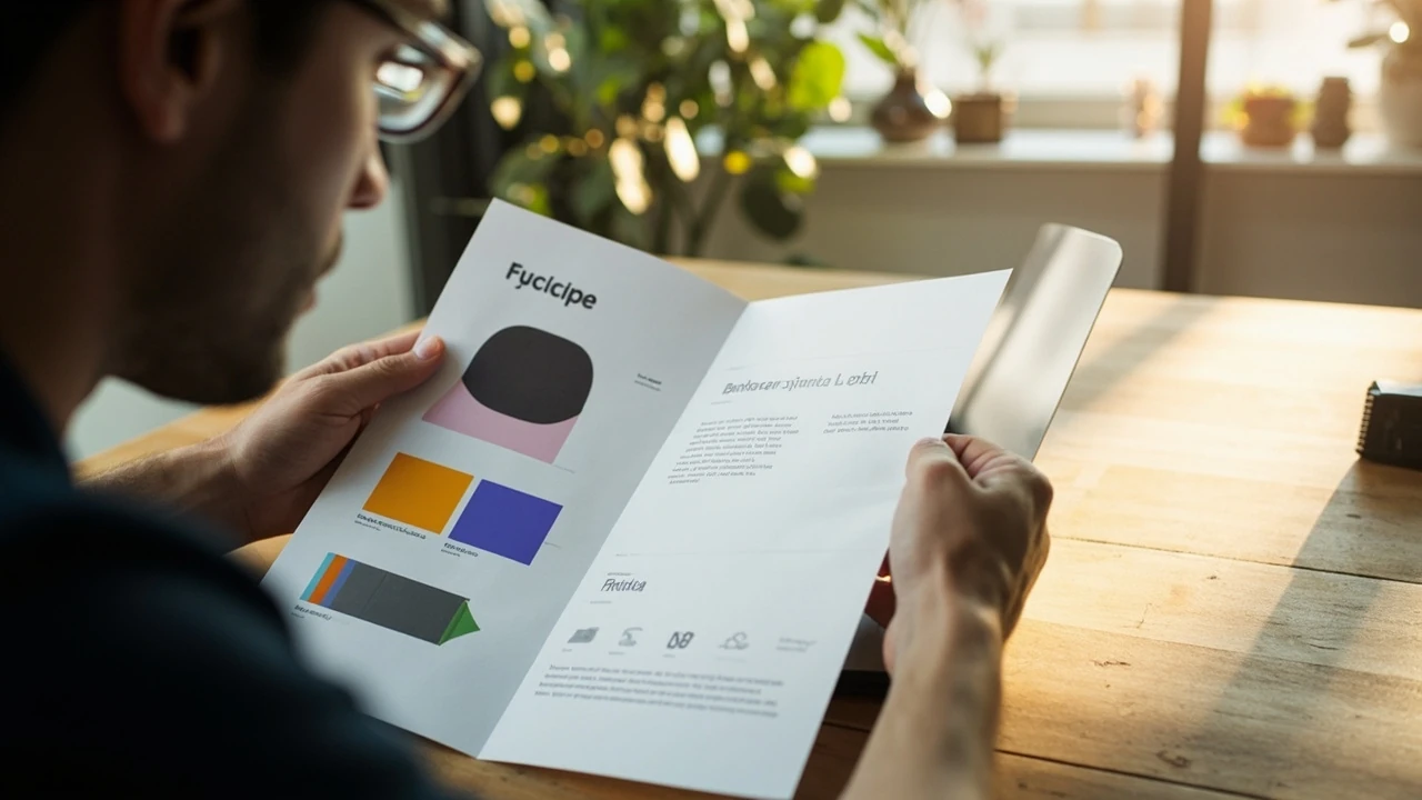
How to create a one page brand guide that teams will actually use
A single sheet of paper can decide whether a brand looks like one company or like five. The most common reason brand guidelines fail is not lack of design skill. It is that the document is too long, too abstract, or too defensive. If a junior designer, a freelance copywriter, or a sales partner cannot absorb the essentials in five minutes, the document is not really a guide. It is a museum piece. A well-built one page brand guide compresses the brand into the few decisions that actually shape a touchpoint, then leaves room for judgment everywhere else.
This article walks through how to create a one page brand guide from a blank page to a finished artifact. It focuses on structure, content choices, and the small editorial decisions that make the difference between a reference people pin to a wall and a PDF no one opens. It is written for in-house brand leads, small studio founders, and solo operators who need a single sheet they can hand to a collaborator without a 40-minute walkthrough.
What a one page brand guide is, and what it is not
A one page brand guide is a single A4 or US Letter sheet that captures the minimum viable brand: the mark, the wordmark, the color system, the type system, a few usage rules, and a tone of voice in one or two lines. It is not a style guide. It is not a brand book. It is not a strategy deck. The deliverable is closer to a cockpit checklist than a manual. If a guideline needs a paragraph to explain, it usually belongs in a longer document or it does not belong at all.
Single-page brand summaries are common in agencies, fast-moving startups, and franchise operations where the people applying the brand rarely speak to the people who set it. They are also useful as an onboarding handout for new contractors. A one page brand guide works best when it sits next to a fuller living document, and acts as a strict front door to it. The longer document answers edge cases. The one page answers the everyday case.
Why a one page format forces better decisions
Designers sometimes resist the format because it forces them to choose. A 30-page guideline can hide weak thinking. A 30-inch sheet cannot. The constraint of a single page means every element has to earn its place. The logo lockup must be the right lockup. The color set must be small enough to actually be used. The voice must be expressible in a sentence. If you cannot defend an element on a one page guide, you cannot defend it in a 40-page guide either.
The format also changes how the brand ages. Smaller documents get updated more often, and updates are easier to ship when only one file is involved. A 2026-era brand team that updates quarterly can keep a single page current with almost no overhead. The cost of editing a one page document is low, which means the cost of leaving it wrong is also low to fix.
Who a one page brand guide is for
The audience is broader than most people assume. A one page guide serves anyone who touches the brand without sitting in a design meeting: sales decks, customer support macros, social media freelancers, packaging vendors, web developers outside the core team, retail franchisees, and even internal recruiters. Each of these readers has a different tolerance for design language. The page has to speak to all of them at once.
It is also for the brand owner. Writing a one page guide forces a founder or marketing lead to commit to a position. Vague brand values become specific color codes. A loose “modern but warm” voice becomes a short list of words the brand uses and words it avoids. That commitment is itself the value of the exercise, even before the document is shared.
Decide the purpose of the page before you design it
Every one page brand guide makes a promise. Some are designed for external partners. Some are designed for internal use only. Some are designed for franchise compliance. Some are designed to support a pitch. Before you start drawing, write one sentence that says who the reader is and what the reader should be able to do after 30 seconds with the page. That sentence becomes the page’s reason for existing, and the test for every element on it.
Common use cases and how they change the layout
A guide for freelance designers usually prioritizes logo usage, color codes, and typography. Tone of voice gets a short note. A guide for an in-house sales team usually prioritizes pitch messaging, do-and-don’t language, and a list of approved imagery. A guide for a product team usually prioritizes UI tokens, accessibility notes, and component references. A guide for a print vendor usually prioritizes color profiles, file formats, and bleed specs. The same skeleton adapts, but the content shifts dramatically. Trying to serve all four audiences on one sheet usually produces a sheet that serves none of them.
Where a one page guide sits in a larger system
A one page guide is the cover, not the body. It should reference, but not contain, the full system. The full style guide may live on a Notion page, a Figma file, or a PDF on a shared drive. The component library lives in code or in a token file. The brand strategy deck lives in a separate presentation. The one page is a routing slip that tells a reader exactly where to go next. Without that routing, the page becomes a dead end, and dead ends get ignored.
Gather the raw brand ingredients first
Before you design, you need content. The fastest way to stall a one page brand guide is to start with a blank InDesign file and try to write the words on the page. Instead, gather a working file of source material: the logo in vector form, the color palette with hex, RGB, and CMYK values, the typefaces and their licensed weights, three or four pieces of approved copy, and a short list of dos and don’ts. The page becomes an editing job, not a creative job. Editing is faster and more honest.
Audit what already exists
Most brands have more raw material than they think. Pull the last twelve months of published assets: the website, the most-used social templates, the sales deck, the email signatures, the packaging, the latest ad. Lay them out and look for the patterns that already happen without anyone deciding them. The audit often reveals a working color set that is smaller than the official one, a typeface that is used far more than the others, and a tone of voice that is consistent even when the documented voice is not. The one page guide should codify what already works, not invent a new system on top of it.
List the decisions the page needs to make
A practical way to find the page’s content is to list every brand question a collaborator has asked in the last year. Common questions include: which logo do I use on a dark background, which color is the primary call-to-action, what is the headline typeface, how do I cite a customer logo, can I rotate the mark, can I put a drop shadow on it, what is the hashtag, and what is the supported pronunciation of the name. Each question is a candidate element on the page. A good one page guide answers eight to twelve of these questions without crowding the page.
Pick the building blocks of a one page brand guide
Most strong one page guides share the same building blocks, in roughly the same order. The order is not sacred, but it does affect how the eye moves. Reading top-left to bottom-right, the order below has been tested across agency handoffs, internal onboarding, and franchise kits. It is a defensible default.
| Block | What it contains | Why it earns its place |
|---|---|---|
| Brand essence | One sentence, the brand promise, the positioning in plain language | Anchors every other choice in meaning, not just look |
| Logo system | Primary mark, secondary mark, clear space, minimum size, misuse examples | Most misuses start here, so it must be the first visual block |
| Color palette | Two to five core colors with hex, RGB, and CMYK or Pantone references | Color drift is the fastest way for a brand to look inconsistent |
| Typography | One primary typeface, one secondary typeface, weights, hierarchy rules | Type is half the brand and often the least documented |
| Voice and language | Two or three tone attributes, three words the brand uses, three words it avoids | Voice without examples is decoration; examples without rules is noise |
| Imagery and iconography | Photography style, illustration rules, icon stroke, do and do-not examples | Sets a default for assets that are created outside the design team |
| Application examples | One social tile, one slide corner, one email header, or one business card | Shows the system working in real layouts, not in isolation |
Not every guide needs every block. A B2B SaaS brand can usually drop the imagery block and keep voice. A retail brand usually elevates the application example. A personal brand may merge the logo and typography blocks. The point is to choose deliberately, not to default to everything.
How to write a brand essence that fits on one line
The brand essence is the hardest line on the page. It needs to be specific, true, and short. A bad essence sounds like a tagline and means nothing. A good essence sounds like a working agreement between the brand and its customer. Try to write it in the voice the brand actually uses when it talks to a customer on the phone, not in the voice a CEO uses in a keynote.
One practical trick is to write three candidate essences and ask a non-marketing colleague to read each one back to a customer without context. The one that survives that read is the one to publish. If the colleague has to explain it, the line is not ready. If the line changes how the customer expects to be treated, the line is the brand.
Examples of workable one-line essences
For a small bookkeeping firm: “Calm numbers for anxious founders.” For a children’s footwear brand: “Shoes that move with the kid, not the parent.” For a developer tools company: “Defaults that respect the engineer’s time.” None of these is a slogan. Each one is a decision rule. The line tells the designer what to draw, the writer what to say, and the support agent what to do. That is the bar.
Build the logo block with usage, not just appearance
The logo block on a one page guide has to do three things: show the mark, protect the mark, and show how not to use it. A single lockup at large size on a white background is not enough. Most brand failures come from edge cases: a logo on a busy background, a logo scaled too small to read, a logo with a drop shadow added by a well-meaning vendor. A good one page block answers those edge cases visually, because a written rule about a drop shadow is rarely read.
| Element | What to show | Space allocation |
|---|---|---|
| Primary lockup | Full color version on light background | Largest, top-left or top-center |
| Reverse lockup | Single-color version on a dark swatch | Equal or smaller than primary |
| Clear space | Diagram showing the minimum padding around the mark | Tiny, set as a callout beside the primary |
| Minimum size | Smallest print and digital size, in mm and px | Footnote or micro-diagram |
| Misuse | Three to four small examples of what not to do | Bottom row, set against the lightest swatch |
Each row of the table is a small commitment. Decide the clear space in cap height, not in millimeters, because cap height scales with the mark. Decide the minimum size once for screen and once for print, and write both. The misuse row is the most important. A single small “do not add a drop shadow” example can prevent more damage than three pages of rules.
Trim the color palette until it is small enough to use
The most common mistake in a one page brand guide is a color palette with nine colors. A nine-color palette is not a system. It is a buffet. Real brand systems work because the choices have been made. For a one page guide, two core colors, one accent, and two neutrals is plenty. Anything beyond that is decoration.
For each color, document the hex value, the RGB triple, and either the CMYK or Pantone reference. CMYK belongs on the page if the brand is printed. Pantone belongs on the page if the brand is physical. For a digital-only brand, hex and RGB are enough. A single line per color is fine. The page is not a color management textbook, but it is the last stop before a freelancer opens Photoshop in the wrong color space.
Why neutrals belong on the page
Neutrals do most of the heavy lifting in most modern brands. A 70/20/10 split between neutral, primary, and accent is a common working ratio. If a one page guide only documents the accent colors, the collaborator will fill the rest of the layout with a rainbow. Documenting two neutrals, including the off-white background and the deep text color, gives the page its real structure.
Choose typefaces that travel well across media
Type choice is half the brand and often the cheapest upgrade a team can make. A one page guide should name one primary typeface, one secondary typeface, and the licensed weights that are allowed. Anything more becomes a font menu. Anything less leaves collaborators guessing. The primary typeface carries the headlines and usually the body. The secondary typeface is for captions, tables, or contrast moments.
Document the hierarchy with real sizes, not with abstract tags. A line that says “headlines 32 to 48 px, body 16 to 18 px” is more useful than a line that says “large, medium, small.” Real numbers travel between Figma and HTML and InDesign. Abstract labels do not.
| Role | Typeface | Weight | Use |
|---|---|---|---|
| Display | Primary | Bold or semibold | Headlines, hero titles, packaging |
| Body | Primary | Regular | Paragraphs, descriptions, long-form |
| UI | Primary or secondary | Medium | Buttons, labels, navigation |
| Caption | Secondary | Regular or italic | Footnotes, fine print, image credits |
For an accessible brand system, the type scale also has to respect reading order. The Web Content Accessibility Guidelines set a useful floor for body text size and contrast. If a one page guide is for a digital-first brand, a short note on minimum body size and contrast ratio is worth adding under the type block. It is the kind of decision a freelance designer will get wrong by default.
Write a voice section that sounds like a person, not a mood board
Voice is where one page brand guides usually fail. A line like “warm, friendly, confident” tells a writer nothing. A better approach is to give the voice a list of allowed words, a list of banned words, and one or two sample sentences. The lists act as a filter. The samples act as a calibration. A writer who reads both can produce a draft that sounds like the brand without a meeting.
- Words the brand uses: straightforward, exact, plain, careful, steady, on time.
- Words the brand avoids: revolutionary, disruptive, game-changing, synergy, holistic, next-level.
- Sample headline the brand would write: “Reports that explain themselves.”
- Sample headline the brand would not write: “Revolutionary insights for the modern enterprise.”
The lists above are not the right list for any real brand. They are an example of the right shape. The list should be short, opinionated, and obviously true to anyone who knows the brand. If the list sounds like every other brand, throw it away and start over. A voice that is indistinguishable from the competition is not a voice.
Connect voice to the rest of the page
Voice is most useful when it is anchored to a layout. Pair the voice block with a small example of a social tile, an email subject line, or a CTA button. The example shows the words in context, which is what collaborators actually need. A voice statement without an example is a wish. A voice statement with an example is a rule.
Pick a small set of imagery rules
Imagery rules can swallow a one page guide if they are not edited. The goal is not to teach photography. The goal is to prevent the worst defaults: stock photos that look like stock, illustrations that fight the type, product shots that are color-cast, and icon sets that use three different stroke widths. Document a single rule for each.
- Photography: real, well-lit, no heavy filters, subjects at natural scale.
- Illustration: flat, limited palette, one stroke weight, no gradients.
- Iconography: 1.5 or 2 px stroke, single corner radius, no filled variants by default.
- Composition: leave at least 20 percent of the frame as breathing space.
These rules do not need pictures on the one page, though a small example strip helps. They need to be short enough that a freelancer reads them in ten seconds and applies them in an hour. If a rule needs a paragraph, it does not belong on the one page.
Include one or two application examples
An application example is the difference between a brand guide and a brand suggestion. A small thumbnail of a social tile, a business card, an email header, or a product label shows the system doing its job. One example is enough on a true one page guide. Two is better if the page is A3 or tabloid. Three starts to crowd the page and the eye stops reading.
The example should be a real layout the brand actually uses, not a concept piece. A “future product launch” mock-up tells a reader nothing they can apply next week. A business card with a real name, a real title, and a real phone number tells a reader exactly how the system holds up under daily use. Choose the most common touchpoint, not the most impressive one.
Lay out the page so the eye knows where to start
A one page guide has a clear reading order. Most readers will scan in an F-pattern, hitting the top-left, the top-right, and the bottom-left first. The brand essence, the logo, and the color block belong in the first scan path. Type, voice, and imagery belong in the second. Application examples belong in the third. Putting everything in a uniform grid feels organized and reads as a wall. A small amount of hierarchy, with one block clearly larger or higher than the others, gives the page a starting point.
Typography of the page itself
The page is a layout, so it should use the same type system it documents. If the guide lists a primary typeface for body, the page itself should be set in that typeface. If the guide lists a display weight, the page should use it for at least one headline. This is a small test that the system works. If a designer cannot set the guide in the brand type, the brand type is too fragile to be a system.
Use whitespace as a structural element
Whitespace is the cheapest design tool on a one page guide. A block with too much text feels like a brochure. A block with the right amount of white space feels like a brand. The rule of thumb is that the page should have at least 25 percent of its area as unbroken white or neutral space. Crowding the page to fit one more rule usually removes the one rule a reader would have remembered.
Decide between print, PDF, and live web formats
One page brand guides live in three common formats: a printed sheet, a single-page PDF, and a live web page. Each has tradeoffs. A printed sheet is great for onboarding kits and franchise packs, and it forces the editor to commit to a fixed size. A PDF is portable, easy to email, and easy to update. A live web page is searchable, linkable, and can route to the longer style guide. Many brands ship all three with the same content, sized for A4, US Letter, and 1280 px wide.
For a small team, a single PDF is usually the right choice. It is version-controlled, easy to attach to a Slack message, and easy to print when a vendor needs a paper copy. A live web page is worth the extra effort only if the longer style guide is also online, so the one page can link to the right sections. The two formats can coexist, but the content should not drift between them. Pick a source of truth, and link the other to it.
Test the page with a real handoff
The true test of a one page brand guide is whether a stranger can use it. Pick a designer, copywriter, or developer who has not seen the brand, hand them the page, and ask them to produce a single asset in 30 minutes. If they can do it without questions, the guide is working. If they ask which logo, which color, which typeface, or which tone, the guide is not. Every question is a hole. The exercise is not a test of the reader. It is a test of the document.
Run the test with at least two different collaborators and two different asset types. A copy test and a layout test usually surface different gaps. A copy test reveals a missing tone rule. A layout test reveals a missing type rule. Fix the gaps in the next version, then run the test again. Two passes are usually enough to get the page to a steady state.
Plan a small update rhythm
A one page brand guide is a living artifact, but it should not change every month. A reasonable rhythm is a full review every six months and small edits as needed. The full review is the chance to retire colors nobody uses, refresh the misuse examples, and update the imagery rules. The small edits are for typos, broken links, and outdated employee names in the application examples. Version the file with a date in the filename rather than with a version number, because dates are easier to sort and easier to cite.
Keep an internal changelog, but do not put it on the one page itself. A changelog on the page turns a guide into a log. The collaborator does not need to know that the previous version used a different primary. The collaborator needs to know what is true now. The changelog belongs in the longer style guide, where it is searchable and out of the way.
Common mistakes to avoid
Most one page brand guides share a small set of recurring problems. Naming them up front saves an editor at least one round of revisions.
- Documenting every color the brand has ever used, instead of the two or three that matter.
- Writing voice as adjectives rather than as word lists and example sentences.
- Using only a clear-background logo example, with no reverse or misuse examples.
- Setting type rules in abstract sizes, like “large” and “small,” instead of px and pt values.
- Including application examples that no one in the company actually produces.
- Letting the page drift into a brochure with marketing copy, slogan fonts, and a tag.
- Treating the one page guide as a replacement for the longer style guide, instead of a cover for it.
Each of these mistakes is fixable in a single editing pass. The faster the editing pass, the more often the page will get edited. That is the loop a healthy brand guide is built on.
How this fits into a broader brand system
A one page brand guide is most useful when it sits next to a fuller system and links to it. The wider system might include a brand strategy document, a component library, a tone of voice playbook, a motion guideline, and a photography direction. The one page acts as a routing layer. The page says: if you need to do X, go to Y. If Y does not exist, the page has to say so explicitly. A guide that pretends to cover everything is the same as a guide that covers nothing.
For teams building a fuller system, the one page is also a forcing function. If the longer style guide contradicts the one page, the one page usually wins because it is the one people actually read. The longer guide should be edited to match. A brand that maintains this discipline across a year will find that the one page guide becomes the spine of the system, not the cover.
If your team is also working on adjacent material, the broader editorial work covered in peak design thinking and creative team practice is a useful companion read. And for the longer strategic view, the practical breakdown of visual identity as a system is the natural next step after the one page is in place.
Frequently asked questions
How long should a one page brand guide really be?
The format is a single A4 or US Letter sheet, printed or digital, with no scrolling. The actual amount of content depends on the brand, but the page itself should not exceed one side. If a piece of guidance cannot fit, it belongs in the longer style guide. The one page is a cover, not a manual.
How is a one page brand guide different from a full style guide?
A one page guide is a summary that a new collaborator can read in five minutes. A full style guide is a reference document that covers edge cases, component specs, accessibility details, and writing rules. The one page answers the everyday question. The full guide answers the edge case. Both should exist together and link to each other.
What is the most important block on a one page brand guide?
The logo usage block usually comes first, because logo misuse is the most common brand failure. The second most important is the color block, because color drift is fast and visible. Voice and type are equally important, but their failures are slower to surface, so they usually get a smaller share of the page.
How many colors should a one page brand guide list?
Two core colors, one accent, and two neutrals is a strong default for a small brand. Larger brands can stretch to three core colors and two accents, but anything beyond five core colors tends to collapse into a buffet that nobody uses consistently. The page should also specify the hex, RGB, and CMYK or Pantone values for each color.
Should a one page brand guide include accessibility notes?
Yes, even if the notes are short. A single line on minimum body text size and a minimum contrast ratio is enough to push most collaborators in the right direction. A more thorough accessibility checklist belongs in the longer style guide, but the one page should not pretend accessibility is someone else’s job.
How do I keep a one page brand guide up to date?
Plan a full review every six months and a small ad hoc edit whenever a new template, color, or logo variant enters the system. Use a date in the filename, not a version number, so the latest version is obvious. Keep a short internal changelog in the longer style guide rather than on the one page itself.
Can a one page brand guide work for a large company?
Yes, but only as a cover for a much larger system. Large companies often produce several one page sheets, each aimed at a different audience: a designer sheet, a sales sheet, a vendor sheet, and an internal recruiting sheet. The one page format is a delivery vehicle, not a strategy. The strategy is the longer system behind it.
What tools are best for laying out a one page brand guide?
Any layout tool will work, including Figma, InDesign, Affinity Publisher, and even Google Slides. The right tool is the one the team already uses, because updates will be more frequent than the original design. Avoid tools that require an export step to share, since the page should be easy to send, print, and link.
How do I measure whether a one page brand guide is working?
Track the questions that come in after a new collaborator is handed the guide. If the volume drops over the first three months, the guide is doing its job. If the questions stay flat or rise, the guide has a hole. The fastest signal is a 30-minute test with a stranger, repeated once a quarter, and tracked as a small dataset.