August 3, 2026 / Brand Strategy
Nails design for brand visuals: how to make manicure content feel like part of your brand
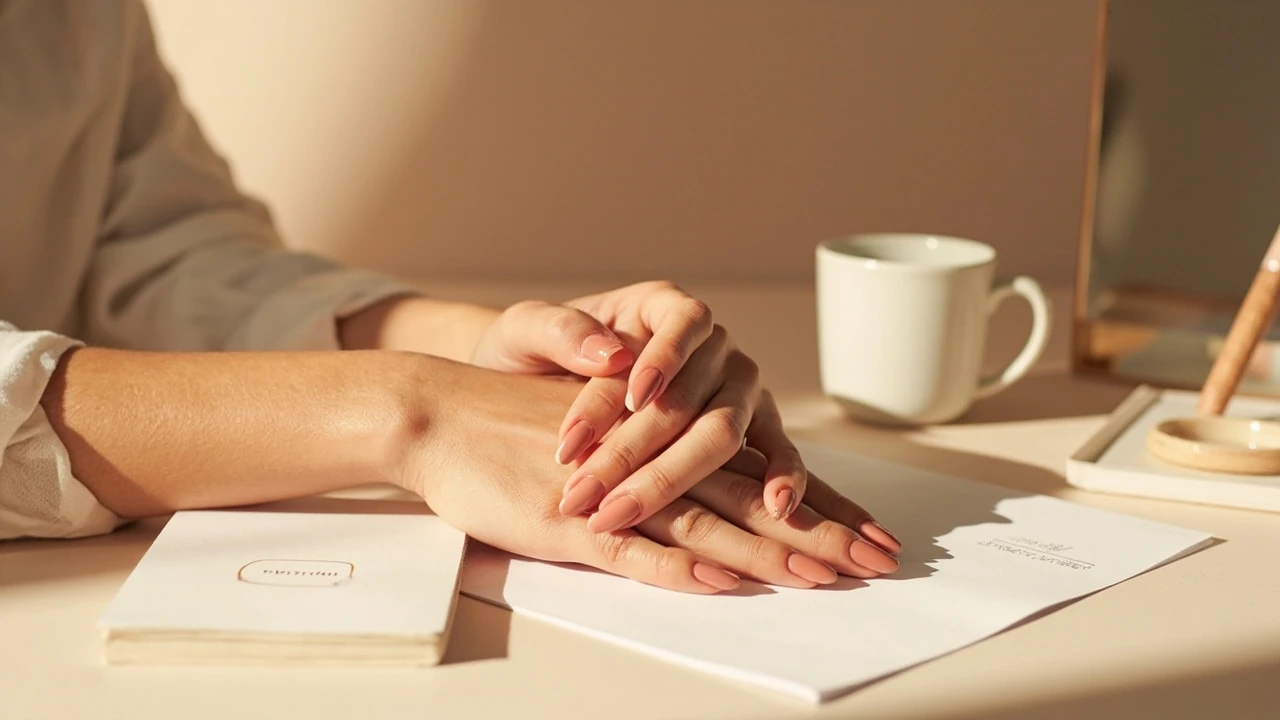
A manicure photograph can quietly support a brand, or it can fight against it. When the color story, finish, and styling of the nails echo the palette of a website, a product line, or a seasonal campaign, the image stops being a personal detail and becomes part of a recognisable visual system. This guide looks at nails design through the lens of brand visuals, with practical attention to palette, photography, content planning, and the small production decisions that decide whether manicure content feels intentional.
Nails design as a brand visual decision
Most small studios and independent brands do not plan manicure content. Hands appear in product shots, behind-the-scenes reels, flat lays, and founder portraits, and the nails simply come along for the ride. When the manicure clashes with the brand palette, the clash is small but real. A warm, saturated red next to a pastel product line, a high-glitter finish on a brand built on quiet minimalism, or a French tip in a campaign aimed at a moody, earthy audience all register as friction, even when viewers cannot name the problem.
Planning nails design with the same care as typography, packaging, and photography gives a brand one more surface that supports the rest of the system. It also makes content production easier. Founders, team members, and ambassadors can be guided by a short brief rather than guessing, and the result reads as a deliberate choice instead of an afterthought.
This article focuses on how to treat nails design as part of visual identity work, not as a beauty tutorial. If you build a small studio, run an independent product line, or manage social content for a service brand, the framework below should help you decide what belongs on the hands that appear in your visuals.
Why manicure details matter in branded imagery
Eye-tracking studies on product photography repeatedly show that viewers look at hands before they read labels. A hand touching a jar, holding a phone, or resting near a product carries a surprising amount of visual weight. The manicure is part of that weight, alongside skin tone, jewellery, and gesture.
There are three practical reasons to treat the manicure as a brand decision rather than a personal one:
- Color continuity. Manicure color is one of the most saturated blocks of color on screen. If it is not part of the palette, it pulls focus.
- Finish continuity. Glossy, matte, chrome, and micro-shimmer finishes each carry a different visual temperature. Mismatched finishes can make a calm brand feel busy.
- Shape continuity. Long stiletto, soft almond, and short square shapes each suggest a different posture. Shape choices should match the tone of the brand, not the personal taste of whoever is in the shoot.
None of this means a brand should police what staff do with their own nails. It means the people who appear in planned content should be briefed, and the same way a brand gives a stylist a wardrobe direction, it can give a manicurist a brief.
Map the brand palette before booking the manicurist
Color decisions for a manicure should start with the existing palette, not with seasonal trends. Pull the brand’s documented color values: hex codes from a style guide, Pantone references from packaging, or simply the dominant tones in a recent campaign. Then decide which of those values is allowed to travel onto the hands.
| Brand palette role | Typical finish | Where it works on nails | Risk if overused |
|---|---|---|---|
| Primary color | Cream or soft glossy | Full coverage, short to medium length | Reads as logo color and feels literal |
| Secondary accent | Satin or micro-shimmer | Single accent nail, French tip, or half-moon | Too loud if used on every hand in a set |
| Neutral or off-white | Soft glossy or milky | Full coverage for minimalist brands | Looks unfinished in low-light photos |
| Deep base or near-black | High-gloss or soft matte | Full coverage for editorial or premium brands | Reads as harsh if the surrounding props are pale |
Once the role is decided, the manicurist can work from a short brief: a named color, a finish, a length range, and a shape. The brief should be in writing, just like a typography or photography brief, and it should sit next to the existing brand assets rather than in a chat thread.
Choose finish and shape with the brand’s tone in mind
Finish and shape do as much work as color. Two brands using the same terracotta can feel completely different because one pairs it with a high-gloss almond and the other with a soft matte squoval. Use the table below as a quick reference when reviewing options for a shoot or campaign.
| Brand tone | Suggested shape | Suggested finish | Why it works |
|---|---|---|---|
| Quiet, minimal, premium | Short squoval or soft almond | Soft glossy or milky | Keeps the visual weight on the product, not the hands |
| Editorial, fashion-forward | Almond or oval, medium length | High-gloss or chrome | Reflects light, supports dramatic lighting setups |
| Playful, bright, service-led | Rounded square, short to medium | Cream or jelly | Reads friendly on small screens and in reels |
| Earth-toned, natural, slow-living | Short rounded or soft almond | Satin or low-shine | Avoids the synthetic feel of high-gloss polish |
| Dark, moody, technical | Short squoval | Soft matte or velvet | Matte absorbs light and suits shadowy compositions |
These are starting points, not rules. The right choice depends on the product, the lighting plan, and the audience. Test a single shoot before committing the choice to a content series.
Build a short nails design brief for content shoots
Most production problems with manicure content come from a missing brief. A useful nails design brief can be one page and should cover the following points.
- Brand context. A sentence or two on the brand’s tone, audience, and the campaign the content supports.
- Palette reference. The named color or hex code allowed on the hands, plus one or two acceptable alternatives.
- Finish. The specific finish requested, written in plain language rather than a polish brand name.
- Shape and length. A reference photo or a clear written description. Include a maximum length so the manicurist can advise on strength and wear.
- Exclusions. Anything that would break the system, such as nail art, decals, glitter, or chrome, should be listed here rather than implied.
- Maintenance window. How long the manicure needs to last across the shoot day or the content calendar.
- Reference images. Two or three stills from previous brand shoots that show the intended hand position, lighting, and styling.
Treat this brief as a living document. After each shoot, note what worked and what did not, and refine the language. Over time, the brief becomes a small but valuable part of the brand system.
Lighting and photography decisions that support the manicure
Even a perfect manicure can be flattened by the wrong light. A few production choices make a real difference when nails design is part of a planned shot.
- Use soft, directional light. Hard light exaggerates chips, ridges, and uneven edges. A large window or a diffused softbox gives a clean read of color and finish.
- Watch the reflection on glossy finishes. High-gloss polish acts like a small mirror. Position the hands so the reflection is a soft gradient rather than a hot spot or a ceiling fixture.
- Match the white balance to the palette. A warm gel or candle on set can push a cream finish toward orange. Set white balance deliberately, ideally with a reference card in the frame.
- Plan hand positions that show the shape. A flat hand hides shape. Soft curls, a hand resting against a product, or fingertips touching a surface all read better on small screens.
- Keep jewellery consistent. Stack rings, watches, and bracelets should match the metal story of the rest of the shoot. Mixed metals compete with the manicure and the props.
These choices sit alongside broader visual identity work. A studio that already plans lighting for products and packaging can extend the same discipline to hands with little extra effort.
Coordinate nails design with a content calendar
Brand content rarely lives on a single channel. The same set of hands may appear on a website, in a newsletter, on social posts, and in paid ads. A manicure that looks right in a sunlit outdoor shot can read as muddy on a backlit phone screen, and the same color can feel warm on a desktop monitor and cool under store lighting.
A short checklist helps align the manicure with the calendar:
- List the channels and screens. Identify the dominant devices and lighting conditions the content will appear in.
- Plan one manicure per content block. Avoid a fresh manicure for every post. Group content so one well-planned manicure supports several pieces.
- Note wear and tear milestones. Photograph the manicure in the first two days for hero content, then move later images to formats that tolerate small chips, such as candid or process shots.
- Coordinate with seasonal palette shifts. If the brand updates its palette quarterly, schedule the manicure to match rather than lag behind.
Planned coordination prevents the most common visual mistake: a hero image on the website showing a manicure that no longer matches the social grid running the same campaign.
Where nails design can quietly break a brand system
It is just as important to know where to hold back as it is to know where to plan. A few recurring problems show up across small studios and independent brands.
- Mixing trend-led and brand-led choices. A trending finish that does not fit the palette will date the content faster than the product it sits next to.
- Over-accessorising the hands. A manicure, three rings, a watch, and a bracelet all compete. Pick the single accessory that supports the brand and let the manicure do the rest.
- Letting personal taste override the brief. A team member who loves a bold design can unintentionally pull a campaign off course. The brief protects the content, not the individual.
- Ignoring skin tone in the color decision. The same color reads differently against different skin tones. Test the swatch on the actual hand that will be in the shot, not on a swatch stick.
- Forgetting the back of the hand. In overhead flat lays, the cuticle line and the underside of the nails are visible. A rushed manicure will show.
Catching these problems before the shoot is much cheaper than catching them in the edit. A short pre-shoot review of the brief, the reference images, and the planned hand positions is usually enough.
Link nails design to wider visual identity work
A manicure brief is most useful when it sits next to the rest of the brand system. Treat it as one of several surface decisions, alongside typography, packaging, and motion. When a studio already has a documented visual identity for color, finish, and tone, a manicure brief simply extends the same logic to the hands.
For brands that have not yet documented their system, planning a single manicure is a good prompt to start. The conversation about which color belongs on the hands often surfaces bigger questions about which colors should be on the packaging, on the website, and on social. Used well, a small production detail becomes a useful strategic exercise.
Studios that already work on wider website strategy can treat nails design as one more touchpoint to plan. The same logic that decides which products sit on the homepage, which photography style runs across the site, and which color sits behind a call to action can also decide which manicure belongs in a hero image.
A practical workflow for a single planned shoot
To put the framework into action, a small studio can follow a simple workflow for any shoot where hands will be visible.
- Confirm the role of the hands. Will they hold a product, frame a face, rest on a surface, or gesture to a screen? The role changes the brief.
- Pull the brand palette and pick the role. Decide whether the manicure should be primary, secondary, neutral, or deep, using the table earlier in this article.
- Write the brief. Use the seven-point brief template and include the named color, finish, shape, and length, plus the exclusions.
- Book the manicurist with buffer time. Schedule the appointment so the nails are fully dry and any last corrections can happen before the shoot.
- Photograph a test swatch on the actual hand. A quick phone test in the planned light catches most color and finish problems before the shoot.
- Photograph in the planned order. Shoot the hero content first, then move to supporting content, so the manicure is at its best where it matters most.
- Review the contact sheet with the brief in hand. Check that the manicure reads as intended on the screens and formats the content will appear in.
This workflow does not need new software or a new role. It is a small set of decisions, written down and reviewed, that turns a personal detail into a brand asset.
Frequently asked questions
How does nails design fit into a brand visual identity?
Nails design fits into a brand visual identity by extending the same color, finish, and tone decisions that already guide typography, packaging, and photography. When the manicure is briefed like any other surface, it stops competing with the rest of the system and quietly supports it.
Should the manicure always match the primary brand color?
No. The manicure can play any of the four roles listed earlier: primary color, secondary accent, neutral, or deep base. In most cases a neutral or a soft secondary reads as more refined than a literal primary color, which can look like a logo on the fingertips.
What finish photographs best for small screens?
Soft glossy and satin finishes tend to read cleanly on phone screens, where reflections from chrome and high-glitter polishes can look noisy. Test the finish in the planned lighting before committing to a full set.
How long before a shoot should the manicure be done?
Most polishes look their best in the first 24 to 48 hours. For a planned shoot, book the manicurist the day before, with enough buffer for drying and any last corrections, and shoot the hero content first.
Do short nails limit brand options?
Short nails actually simplify brand work. They are easier to keep on brief, easier to maintain across a content calendar, and easier to photograph in tight product shots. A clean short squoval in the right color often reads as more confident than a long elaborate shape.
How do I brief a manicurist without dictating personal style?
Frame the brief around the campaign, not the person. Reference the brand palette, the lighting plan, and the role of the hands in the shot. A good manicurist will translate that into a shape, length, and finish that fits the brief and the wearer’s hand.
What is the most common mistake with manicure content?
The most common mistake is letting the manicure follow personal taste rather than the brand system. The second most common is forgetting to test the polish on the actual hand in the actual light before the shoot.
Can a single manicure work across website, social, and print?
Yes, if the palette, finish, and length are planned with all three channels in mind. A soft neutral with a satin finish usually travels well across screens and print. Highly reflective finishes can be harder to control in different lighting conditions.
How does nails design relate to accessibility?
Manicure content sits inside a wider set of decisions about color contrast, photography clarity, and visual hierarchy. The same attention to legibility that guides a website’s color choices, including the work described in this practical guide to web accessibility, applies to imagery. A manicure that pulls focus from a product can be a quiet accessibility problem on a small screen.
Where should nails design live in a brand style guide?
Keep the rules short: one paragraph on the allowed palette role, one sentence on the finish, and one sentence on the shape and length. Add a small reference image. Anything longer is harder to follow and easier to ignore on a busy shoot day.