August 10, 2026 / Brand Strategy
Nail design in brand visuals: how manicure styling shapes modern aesthetics
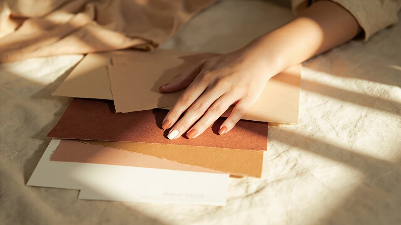
Nail design as a working part of brand and personal visual identity
A founder is reviewing photos for a new product page and notices that her hands, holding the product, carry a glossy red manicure. The same hands appear on the homepage hero image, the about page, and a podcast thumbnail. Without anyone calling it a brand decision, the nail design has already joined the typography, the photography palette, and the logo. The same thing happens in personal styling, on social media, and in fashion editorials, where a single manicure choice can either support the visual story or quietly fight it.
This guide treats nail design as a small but loaded visual decision. It looks at what nail design actually includes, how it intersects with brand identity, content planning, and accessibility, and the practical checks that help a studio, a founder, or an individual avoid manicure choices that look dated, mismatched, or distracting within a few months.
What nail design actually means in 2026
The phrase nail design describes the full set of choices that shape how a manicure looks on the nail, from the silhouette of the nail itself to the finish on top. It is a broader term than nail art, which usually refers to detailed painted patterns, decals, or 3D embellishments layered on a finished manicure. A nail design decision typically includes:
- nail shape: almond, coffin, square, squoval, round, stiletto, or ballerina;
- length and structure: short, mid-length, long, or extensions;
- color and finish: cream, chrome, magnetic, glass, jelly, sheer, matte, or high-gloss;
- surface treatment: solid color, ombré, French, micro-French, micro-details, or hand-painted imagery;
- embellishments: chrome powders, foils, dried flowers, beads, studs, or stickers.
In professional contexts, nail design is the brief a client or a creative director gives before a manicure appointment. In personal styling, it is the unspoken detail that ties an outfit, a beauty look, and a photo concept together. In brand work, it is one of the small set of beauty decisions that can either reinforce or dilute a visual system.
Why nail design belongs in a visual identity conversation
Most visual identity guides cover logo, color, type, photography, and motion. Few cover hands, even though hands appear constantly in product photography, tutorials, behind-the-scenes content, and founder-led social posts. The result is a quiet gap. The brand has a strict color system for packaging, but the founder’s manicure in every other photo is a random trending color pulled from a feed.
For studios like the one at this visual identity overview, nail design is worth treating as a sub-decision of the broader identity system. The goal is not to lock people into one manicure forever, but to make sure that any nail choice can be checked against the same logic as a font, a background color, or a product shot.
Three signals tend to make nail design more important to a brand or a public figure:
- Hands are visible in core imagery: products held in hands, manicure-led services, food, jewelry, and craft categories.
- Audience age skews toward segments where beauty details are part of the brand promise, such as fashion, beauty, lifestyle, and wedding services.
- Content cadence is high, so small inconsistencies compound quickly across dozens of weekly posts.
Nail design shapes that work in photographs and on screens
Nail shape is the first design decision because it sets the silhouette before color and finish are even considered. In photo-heavy work, shape interacts with lighting, skin tone, and gesture. Some shapes flatten on camera, others become dramatic highlights. The table below summarizes how common shapes read in a visual context.
| Shape | Visual effect | Best fit | Watch out for |
|---|---|---|---|
| Almond | Elongating, soft, classic | Editorial shoots, bridal, founder portraits | Weak on very short nail beds |
| Coffin or ballerina | Bold, modern, statement | Fashion, music, performance | Reads heavy in close-up product shots |
| Square or squoval | Clean, architectural, neutral | Tech, product photography, B2B | Can feel blunt on very long beds |
| Round | Soft, approachable, low-maintenance | Lifestyle, hospitality, personal brands | Less visible in wide shots |
| Stiletto | Sharp, dramatic, high-fashion | Editorial covers, performance brands | Restricts hand gestures and typing |
The most common mistake is picking a shape based on a single trending image, then realizing that it does not survive the realities of the shoot. A stiletto manicure in a quick behind-the-scenes Instagram story will look fine, but the same manicure in a product unboxing video can make it physically hard to open packaging. A round shape disappears on a wide lecture-hall photo, while a coffin shape dominates an otherwise minimalist hero image. The shape has to survive the actual use, not just a single curated photo.
Color, finish, and the small details that carry the brand
Color is where nail design has the most leverage. A nail polish sits on the hand the same way a logo sits on a page, so it has to be checked against the same palette considerations. Designers usually look at four questions:
- Does the color clash with the brand’s hero swatch, especially in close-up product shots?
- Does the finish match the mood: matte for quiet editorial, chrome for nightlife, cream for everyday?
- Is the contrast against skin tone intentional, or is it accidentally flattening the hand in photos?
- Does the color hold up under different lighting: warm tungsten, cool daylight, and phone flash?
Finish is the second lever. The same red can feel entirely different as a cream, a jelly, a magnetic cat-eye, or a chrome. Cream finishes read as the most consistent across lighting and screens, which is why they are the safest base for brand-facing work. Chrome and magnetic finishes are visually strong but very lighting-dependent, and they can shift to a near-black or a near-white in a phone flash, which surprises people in candid shots.
Detail choices like French tips, micro-French lines, ombré gradients, or hand-painted micro-art are the equivalent of an accent font. They can lift an otherwise minimal look, but they also date quickly. A bold chrome French tip that feels fresh now is likely to feel like a recognizable era within a few years. For brand-facing hands, the safer move is a restrained detail over a stable base, not a loud detail on a loud base.
Nail design and the visual system of a brand
For studios working on visual identity, nail design is easiest to manage when it is treated as a small module inside the broader system described in a visual identity guide. The most useful model is to define a small set of approved looks rather than a single permanent choice. A reasonable structure for a brand or public-facing personal brand is:
- A core look: the default manicure that shows up in about 70 to 80 percent of content, usually a cream or soft finish in a neutral or signature color.
- A campaign look: a temporary manicure tied to a specific launch, season, or event, with a defined end date.
- An exception look: a high-impact manicure for a single editorial moment, a performance, or a specific piece of content, kept off the everyday feed.
This three-tier system keeps the visual system consistent without trapping anyone in a single manicure for months. The core look is the equivalent of a brand’s primary color. The campaign look is a seasonal accent. The exception look is the equivalent of a one-off campaign visual, useful for impact but never the daily default.
Matching nail design to content format
Different content formats put different pressure on a manicure. A look that is perfect on a still photograph can be wrong for a video, and a video-friendly look can feel flat on a wide lecture shot. The matrix below maps common content formats to the nail design decisions that tend to work best in each.
| Content format | Hand visibility | Recommended shape | Recommended finish | Detail level |
|---|---|---|---|---|
| Studio product shot | High, central | Squoval or almond | Cream or soft jelly | Minimal or none |
| Founder talking head | Medium, gesture only | Almond or round | Cream or soft chrome | Minimal |
| Behind-the-scenes reels | Medium, moving | Round or squoval | Jelly or cream | Subtle, optional |
| Editorial or cover shoot | High, styled | Stiletto, coffin, or almond | Chrome, magnetic, or high-gloss | Bold, intentional |
| Speaking, panels, lectures | Low to medium | Round or squoval | Cream or matte | None or micro |
| Wedding or event | High, ceremonial | Almond or soft coffin | Soft pearl or cream | Micro or subtle French |
The pattern is simple: the more a hand is the focus, the more intentional the design needs to be. The less a hand is the focus, the more neutral and quiet the design should be, so it does not compete with the actual subject.
Nail design and accessibility
Nail design is also a small accessibility and inclusion decision. Hands appear in the same imagery as skin, jewelry, and gesture, and they affect how different audiences read a brand. A few considerations worth documenting in any internal brand guide:
- Color contrast against skin tone affects visibility in dimly lit venues, lecture halls, and older screens.
- Highly textured or 3D embellishments can be unreadable in small thumbnails and may snag on camera equipment or instruments.
- Some audiences associate very specific color combinations with strong cultural or subcultural signals, which may be desirable or distracting depending on context.
- Hands that touch a lot of public surfaces, including food, products, and tools, need a design that holds up under frequent sanitizing.
For a deeper look at how visual decisions interact with broader digital inclusion, a practical accessibility guide covers the principles that translate well into physical visual decisions like nail design.
How to brief a nail design before an appointment
The best manicure outcomes usually start with a clear brief, the same way any other visual deliverable does. A short brief helps a nail technician understand not just the color, but the role the manicure will play on camera, on stage, or in everyday life. A useful pre-appointment brief covers five points:
- Primary context: editorial shoot, product launch, founder content, personal wear, or a specific event.
- Hand visibility: how often the hands will be visible, and at what size on screen or in print.
- Wardrobe palette: the dominant clothing colors, so the manicure either matches intentionally or contrasts intentionally.
- Lighting: tungsten, daylight, mixed, or controlled studio, since chrome and magnetic finishes change dramatically under different lights.
- Maintenance window: how long the manicure needs to last between refreshes, given the shoot or content schedule.
Many studio shoots and brand campaigns now bring a small nail moodboard to the appointment, similar to the color and texture references used for set design. This is often the difference between a manicure that fits the shoot and one that quietly fights it.
Nail design for personal branding, not just companies
Nail design is not only a brand-system decision. For freelancers, founders, creators, and public-facing professionals, the manicure is one of the few small but persistent aesthetic signals that people see across weeks or years of content. The same logic applies, just at a personal scale.
Three practical moves tend to work:
- Choose a default nail color and shape that survives most of your wardrobe, not a single favorite outfit.
- Allow one or two seasonal accents a year, and skip the rest. Visual consistency on personal feeds is built by what is repeated, not by what is new.
- Avoid letting a manicure decision be made by the last social post you saw, especially right before a major content week.
For people who already think in terms of capsule wardrobes and signature accessories, the manicure is just another slot in that system. Treating it that way removes a surprising amount of day-to-day decision fatigue.
Common nail design mistakes that hurt a visual system
Even with a clear brief, certain patterns show up again and again across shoots, profiles, and public events. The most common issues are:
- Trend chasing without testing: copying a viral manicure that does not match the existing palette, skin tone, or content format.
- Mixing too many finishes: cream on one hand, chrome on the other, or alternating finishes that fight for attention in a single frame.
- Ignoring cuticle and nail health: even a perfectly chosen color reads poorly if the surrounding skin looks dry, damaged, or stained.
- Forgetting the underside: long extensions in overhead shots can reveal a contrasting underside color that breaks the look.
- Choosing detail that ages fast: very specific motifs, character art, or year references that immediately date the content.
A useful internal test is to look at the last twenty photos where the hands are visible and ask whether the manicure either supports or distracts from the rest of the frame. If the answer is mixed, the nail design is probably fighting the visual system rather than reinforcing it.
How often to refresh a nail design within a content cycle
Frequency matters as much as the choice itself. A manicure that looks deliberate in week one can start to look tired by week three if the content cadence is high. The most stable approach is to plan refreshes around content milestones rather than calendar weeks. A simple rhythm that works for many studios and founders is:
- Refresh one to two days before any major shoot, launch, or appearance.
- Refresh after any content block that includes more than three posts with visible hands.
- Plan campaign-specific designs for launches, then return to the core look afterward.
- Use simple at-home maintenance, like a clear top coat, between professional appointments to extend wear.
This rhythm is similar in spirit to how a content calendar treats publishing windows. Nail design is treated as a deliverable with a life cycle, not as a one-time event.
Nail design trends worth watching in 2026
The current cycle is leaning toward restraint after a few years of maximalist nail art. Several directions are worth tracking, with the usual caveat that trend language shifts fast and any specific motif can feel dated within a season.
- Soft neutrals in unexpected finishes, including milky jellies and quiet chromes in nude tones.
- Micro-French and ultra-thin lines, replacing thicker smile-line designs.
- Glazed finishes, often in pearlescent or soft chrome, paired with shorter almond or round shapes.
- Tonal layering, where two or three close colors build depth without contrast.
- Quiet embellishments, like a single small bead or a single thin metal line, instead of dense patterns.
Trends are most useful when they can be adapted to a brand’s existing system. A tonal layering approach, for example, fits a calm editorial brand far better than a high-contrast graphic pattern, even when both are technically on trend.
Nail design and inclusive visual decisions
Visual identity work is increasingly expected to consider a wider range of hands, skin tones, and personal presentations than older style guides did. Nail design is part of that shift. A few points that often go undocumented but matter in practice:
- Undertone matters: the same polish reads differently on cool, warm, and olive skin tones, so a brand’s “signature” nail color should be tested on a representative range of hands before being locked in.
- Shape and length should be considered as personal comfort decisions, not just aesthetics, especially for people who type, play instruments, or work with their hands.
- Allergy-friendly and breathable formulas are now a baseline expectation for many clients, and are worth listing in a brand-facing brief to avoid future restrictions.
These are small details, but they accumulate into a visual system that respects the people who carry the brand on camera every day.
Building a small internal nail design guide
Studios and public-facing individuals who work on a long-term content calendar benefit from writing a short internal document that captures the decisions above. A practical one-page guide usually includes:
- The default core look, with a swatch or reference image.
- Two or three approved campaign looks, with notes on when each applies.
- Do-and-don’t examples from past shoots, both good and bad.
- Notes on lighting, content format, and wardrobe interaction.
- Maintenance rhythm and refresh triggers, tied to the content calendar.
This kind of document is small, but it removes a surprising amount of ambiguity, especially when multiple people are making decisions about the same hands across shoots, interviews, and social posts.
Frequently asked questions
What is the difference between nail design and nail art?
Nail design is the overall set of choices that shape a manicure, including shape, length, color, finish, and any details. Nail art refers specifically to decorative elements like hand-painted imagery, decals, or 3D embellishments. All nail art is part of a nail design, but not every nail design is nail art.
How does nail design fit into a visual identity system?
It works as a sub-decision of the broader identity, similar to a color, a type style, or a photography treatment. The goal is to make sure that any nail choice either supports the existing palette and mood or is a clearly defined exception tied to a specific moment.
Which nail design lasts the longest in photos?
Soft cream finishes in neutral or mid-tone colors tend to read consistently across lighting and screens. Chrome and magnetic finishes are visually striking but lighting-dependent, and bright neons can shift dramatically under phone flash.
How short is too short for nail design choices to matter?
Even on short nails, shape and color still carry the design. A short, well-shaped nail in a thoughtful color will read more intentionally in imagery than a long, damaged nail in a random color, especially in close-up product or beauty shots.
How often should a brand-facing nail design be refreshed?
Plan refreshes around content milestones rather than calendar weeks. A common rhythm is to refresh before any major shoot, after a block of three or more posts with visible hands, and whenever switching from a campaign look back to the core look.
Can nail design support accessibility goals?
Yes, indirectly. Choosing finishes that hold up under varied lighting, avoiding 3D embellishments that snag or distract, and considering contrast against skin tone all help audiences read imagery more comfortably, including in dim venues or on smaller screens.
What should be in a brief for a nail appointment before a shoot?
Cover the primary context, how visible the hands will be, the wardrobe palette, the lighting setup, and the expected maintenance window. A small reference image of the intended look is often the most useful part of the brief.
How do I avoid nail design choices that look dated quickly?
Favor restrained details over loud ones, choose finishes that survive different lighting, and avoid year-specific or character-specific motifs. Treat very specific trends as one-off campaign looks rather than core looks.
Is nail design only relevant for beauty and fashion brands?
No. Any brand or individual whose hands appear in product shots, tutorials, founder content, or speaking appearances is making a nail design decision whether or not it is documented. The relevance is highest where hands are central to the imagery, but the principle applies broadly.
What is a practical first step if my brand has never documented a nail design direction?
Audit the last twenty to thirty images where the hands are visible, identify which manicures support the visual system and which fight it, and from that pattern define a single core look to use as a default going forward.