November 20, 2026 / Brand Strategy
Fortnite Character Design: A Practical Guide to Creating a Memorable Character
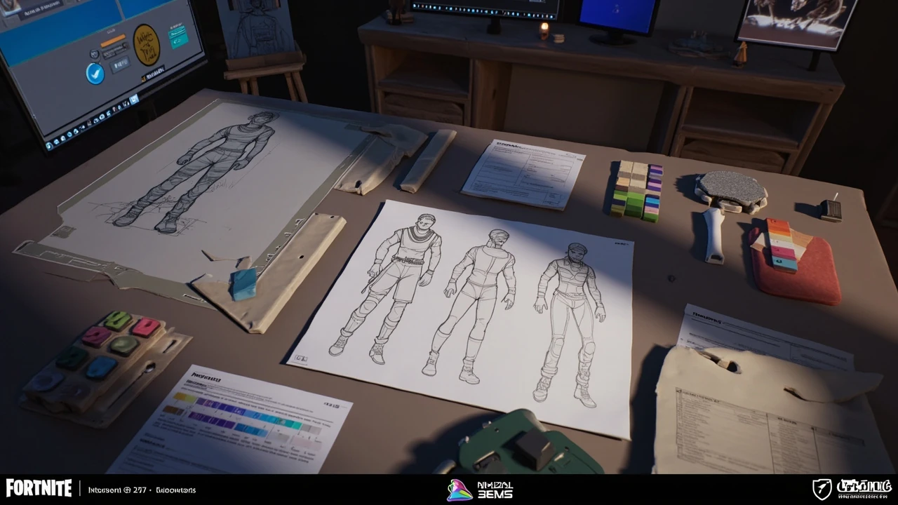
Fortnite character design: how to turn visual identity into a playable skin
A Fortnite skin can look distinctive before the character makes a single move. Its silhouette, palette, material treatment, face, equipment, and animation language communicate what the character is meant to do and how players should recognize it. That recognition becomes difficult when every new outfit needs to work inside the same combat system, technical budget, and cosmetic economy.
This guide examines Fortnite character design as a production problem rather than a collection of style references. It covers concept development, silhouette, modularity, materials, animation, technical validation, and review. The central question is simple: does every visual decision reinforce the character’s identity without creating avoidable cost in modeling, rigging, animation, rendering, or live operations?
For broader context on how a strong visual identity becomes memorable across formats, see Creative memories: designing brand moments people remember. For a related view of how the player’s experience depends on interaction and feedback, see Gaming controller: how input design shapes the player experience.
What makes a Fortnite character work as a cosmetic
A successful cosmetic must read clearly at gameplay distance, remain recognizable in a busy scene, and survive movement, lighting, animation, and repeated use. Cosmetic status does not require power, rarity statistics, or gameplay advantages. Instead, the design has to communicate identity while fitting the shared rules of the game’s character presentation.
Character work on Fortnite has involved separate skeletal structures for heads and bodies, with clothing and accessories contributing to the visible assembly. A useful technical discussion of how Fortnite characters are modeled, skinned, and clothed appears in the Unreal Engine forum thread How are Fortnite characters modelled, skinned, clothed, which provides useful background for this point. The discussion highlights the practical relationship among morph targets, part swapping, material swapping, skeletal animation, and network replication. These are production constraints a concept artist must understand even when the final asset is created by a large pipeline.
| Design quality | Player-facing question | Production question |
|---|---|---|
| Clear silhouette | Can I recognize the character in an action scene? | Which features remain readable when the mesh is small or partially covered? |
| Strong color separation | Can I separate the character from the environment? | Do the materials remain distinct under lighting and post-processing? |
| Consistent identity | Does the outfit suggest a specific role, faction, or personality? | Do the concept, model, materials, and animation tell the same story? |
| Controlled complexity | Does detail reward closer inspection without creating visual noise? | Can the model, rig, materials, animation, and optimization work be maintained? |
Readability should be tested in several contexts, not only on a character turnaround. A shape that works in a neutral menu render may become unclear during a sprint, landing, emote, or combat exchange. The same material may react differently under a bright outdoor environment, a dark interior, or a full-screen effect. A production concept review should therefore include context images and motion, not just polished front views.
Start with a design brief that limits the first decision
Character development becomes vague when the brief is only “make a new skin.” A useful brief identifies the character’s visual premise, intended read, gameplay context, customization relationship, and technical boundaries before the artist explores shapes.
The premise should be specific enough to guide choices. “A hardened frontier marshal” implies different equipment, material wear, colors, and body language than “a ceremonial cyber-mascot.” The premise does not need to be a biography. It should create a set of visual decisions.
- State the identity. Define the role, personality, source, or story impression the character should communicate in one sentence.
- Set the visual read. Choose three to five qualities that should remain recognizable, such as cautious, ceremonial, improvised, predatory, or luxurious.
- Define the contrast. Identify what makes the design different from existing cosmetics and from the player’s normal field of view.
- Specify the context. Record expected camera distances, common emotes, surrounding environments, and any animation-specific requirements.
- Establish constraints early. Note asset reuse, modular parts, skinned mesh limits, material requirements, LOD expectations, and approval responsibilities.
Art directors should also decide which parts of the concept are flexible and which are non-negotiable. If the helmet, shoulder pieces, and weapon accessory are intended to support modular customization, the silhouette cannot depend on one irreversible feature. If the design is meant to exist as a complete outfit, part-swapping ambitions should be reduced or removed.
Build a silhouette that survives the camera
Silhouette is the fastest recognition system a character has. Before judging surface detail, reduce the character to a solid black or white shape and examine it at several sizes. A strong design can still need work, but it should not collapse into a generic body with small accessories.
Useful silhouette decisions include the head shape, shoulder width, chest volume, waist shape, coat or armor edges, and the distribution of mass. A compact character with broad shoulders communicates differently from a narrow figure with long trailing elements. Large back accessories can create identity, but they can also distract from the body, intersect with the environment, or create expensive collision and animation work.
| Silhouette strategy | Potential benefit | Risk to test |
|---|---|---|
| Broad shoulder profile | Creates a stable, memorable outline | May make several characters feel structurally similar |
| Long coat or trailing panel | Adds directional movement | Can intersect with the body, snag in animation, or read as a flat surface |
| Head or face enlargement | Supports expressive posing and emotes | May require a separate head treatment and complicate proportions |
| Large back-mounted element | Signals equipment and affiliation instantly | Increases occlusion, physics, and camera awareness requirements |
| Asymmetric equipment | Creates a memorable directional cue | Can make alternate modular combinations look unbalanced |
The most effective silhouette work often happens before the model reaches final detail. Artists should push shape language, proportion, edge rhythm, and negative space. Surface decoration can then reinforce an established outline rather than compensate for a weak one.
Design a palette that remains legible in motion
A distinctive palette is useful only if the player can separate its major zones. A palette should establish hierarchy: which shape is the focal point, which material feels structural, and which detail is meant to be discovered at close range.
Begin with a limited set of functional colors rather than a large collection of decorative colors. Assign each color a job. One can define the body, one can mark equipment, one can indicate energy or material contrast, and one can act as a small accent. This prevents every element from competing at the same intensity.
- Base color: establishes the largest connected area and the body’s visual identity.
- Secondary color: separates major forms or costume layers.
- Accent color: directs attention to a face, emblem, weapon, or signature feature.
- Material value: separates hard equipment from fabric, skin, metal, or translucent elements.
- Neutral support: grounds the palette and prevents the design from becoming visually exhausted.
Do not evaluate the palette only against a neutral studio background. A character intended for a bright beach can disappear if its lower values match sand and stone. A dark character can merge into an industrial interior. Since environments vary, the palette should retain at least one stable contrast relationship across common settings.
Material behavior is as important as the base color. Gloss, roughness, metal response, translucency, emissive treatment, and texture scale can shift the perceived hue and value. Metallic trim may not behave like a painted plastic plate, and an emissive element may dominate the image in darkness. A palette test should therefore include material previews, not flat color swatches alone.
Use shape, material, and wear as separate layers of storytelling
Fortnite cosmetics often combine engineered equipment, fabric, skin, hair, jewelry, and signs of wear. The strongest design language usually comes from assigning a role to each layer. A silhouette communicates the overall form. Construction tells the viewer how the character is assembled. Surface treatment implies use, status, or culture.
Think of these as linked but independent controls:
- Form determines what the character is made from and how its volumes are organized.
- Material determines how those volumes catch light and react to the environment.
- Pattern adds local information without changing the underlying construction.
- Wear suggests history, pressure, or occupation.
- Color separates those systems and establishes visual priority.
For example, “scratched metal” combines form, material, and wear. If scratches are painted onto the texture without changing roughness or edge treatment, the result may read as a decal rather than damaged metal. A paint chip can be convincing only when the exposed material underneath has a plausible color, roughness, and edge behavior.
Texture resolution also has design implications. Fine scratches may disappear on small menu previews, mobile displays, and distant gameplay. Larger damage shapes may survive better, but excessive texture density can increase asset size and production time. Test representative texture scales in-engine and judge them under the same lighting and post-processing used in the game.
Decide whether the design is a complete skin or a modular system
One of the earliest technical decisions is whether the character is authored as a fixed composition or as a set of swappable parts. That choice changes the concept, model topology, rig, material setup, animation authoring, and testing workload.
| Design area | Complete skin | Modular system |
|---|---|---|
| Concept workflow | Optimizes one complete silhouette | Must show parts in multiple combinations |
| Modeling | Can resolve intersections around the chosen outfit | Needs shared attachment rules and predictable boundaries |
| Materials | Can tune one coordinated appearance | Needs compatible material slots and shared conventions |
| Rigging and animation | Can target the final body and costume | Must anticipate weight, range of motion, and part variation |
| QA | Tests one assembled result | Tests combinations, combinations count, and invalid pairings |
| Production risk | Lower combinatorial scope | Higher upfront planning and greater long-term maintenance |
Modularity is attractive because it can increase player expression and create a broader cosmetic system. It is also less forgiving. A helmet that looks balanced on one body may collide with a hairstyle. A torso piece that fits one animation pose may expose gaps in another. A material intended for one body region may not share the same shading assumptions as the rest of the outfit.
For a new system, establish these rules before creating a large part library:
- Define the body and head separation.
- Choose the canonical rig and animation range.
- Set attachment sockets and their local orientations.
- Define material slots and expected shading behavior.
- Establish naming, file, and version-control conventions.
- Build a small representative kit before scaling production.
Kitbashing can help assemble visual ideas quickly, but it should not hide unclear boundaries. If a part is intended to remain permanent, define how it will join adjacent parts. If it is intended to be swappable, define which surface remains visible when another part replaces it.
Plan the face and head for expression, scale, and inspection
For additional context, Fortnite’s visual language permits strong stylization, but the head still has to support recognition and performance. The face communicates attitude at menu scale, yet players will also see it during emotes and gameplay. A memorable head shape can be more useful than a dense cluster of tiny facial details.
Establish the head’s primary read first: expression, helmet structure, hairstyle, facial silhouette, or a combination. Small elements such as freckles, seams, scars, and paint patterns can add specificity, but they need a separate close-range review.
Check the face under several conditions:
- Neutral light and directional light.
- Small preview size and close menu size.
- Still portrait and active animation.
- Color-blind simulation and reduced-saturation review.
- Different head, hair, or facial options if customization is supported.
Expression changes can move vertices, slide textures, or expose hidden surfaces. If a design relies on a fixed mouth shape, cheek markings, or an eye decal, those details should be tested against the actual facial deformation used in the relevant animation set.
Make the costume animation-ready before detail modeling
A costume that looks excellent on a static model can fail when it moves. The production team should identify the main poses that constrain the asset early, including idle, run, jump, fall, landing, combat, crouch, and signature emotes.
Look for deformation problems such as clipping, stretching, unstable secondary shapes, detached accessories, exposed gaps, and intersections with the body. These issues are cheaper to solve before the asset receives dense materials and texture work.
| Animation issue | Early warning sign | Useful correction |
|---|---|---|
| Clothing intersection | Two surfaces occupy the same space in a bent pose | Adjust panel shape, thickness, or the rig before detailing |
| Exposed gap | An intended covered area separates from the body during motion | Define how the joint is supported or concealed |
| Texture stretching | Patterns distort sharply at elbows, hips, or knees | Reposition UVs or revise the surface layout |
| Accessory lag | A mounted object appears detached during acceleration | Use an appropriate attachment method and test its range |
| Emote conflict | A gesture passes through a large prop | Test the signature animation before locking the prop design |
Large coats, capes, armor plates, and backpacks need a clear motion strategy. Simulating every piece may be visually attractive but can complicate gameplay clarity and performance. A rigid attachment, constrained deformation, baked animation, or selective simulation may be more appropriate. The choice depends on the asset’s role and the animation constraints, not on a universal rule.
Build a review process around evidence from the engine
Concept approval and engine-ready approval answer different questions. A concept can succeed because its identity, proportions, and style are strong even if the mesh is not ready. The engine review determines whether that identity survives the actual character, lighting, animation, camera, and optimization pipeline.
Use staged review gates with a specific artifact at each stage.
- Silhouette review: approve proportion, mass, and primary forms before rendering focus shifts to detail.
- Color and material review: inspect the palette and surface hierarchy in representative lighting.
- Graybox rig review: test deformation, attachment, and emote clearance with final-topology approximations.
- Texture and material review: check texel density, wear, seams, and value separation in the engine.
- Animation review: validate gameplay poses, movement, and signature emotes.
- Optimization review: verify the asset against the project’s technical budget and LOD expectations.
Feedback should identify the layer under review. “The design is unclear” is difficult to act on. “The back accessory merges with the torso in the landing camera” tells the artist which shape, attachment, or value relationship needs revision. This produces faster iteration and prevents cosmetic details from obscuring a fundamental readability problem.
Use constraints to improve the concept instead of shrinking the ambition
Technical limits often produce better character design when they are introduced early. A shared material palette encourages clever combinations. A limited texture budget rewards clear forms and strategic markings. A modular rig forces a team to think about stable attachment points. A crowded environment requires stronger value contrast rather than more decorative detail.
Constraint is not a justification for a generic result. Once a viable direction exists, use technical rules to sharpen its identity. If a character is based on layered fabric, the modular system can focus on removable outer layers, changing volume and revealing underlayers. If the identity comes from a face, the system can preserve the head while varying simpler equipment. If it comes from equipment, the body can remain stable and support greater material variation.
A useful design review asks three questions:
- Which feature communicates the character most efficiently?
- Which details are necessary for the close view but harmful to the distant view?
- Which system rules can remain invisible to the player but simplify production?
What should a character pitch include?
A character pitch should communicate the idea and its production logic before the final asset exists. A large sheet of polished costume images can obscure whether the design can survive the game’s technical and animation constraints.
A strong pitch normally contains:
- A one-sentence character and visual premise.
- Front, side, and back silhouette views.
- A small palette and material key.
- Detail callouts for signature features.
- Expected modular boundaries, if applicable.
- Pose or animation tests for moving pieces.
- Intended environmental and lighting context.
- Known risks, dependencies, and decisions still required.
The pitch should separate intent from certainty. A concept may propose a ribbon-like cloth element, but the team may still need to decide whether it will be simulated, rigged, or shaped. It should also separate canonical features from possible additions. A review should not approve an attractive collage whose hidden pieces conflict with the proposed construction.
How to test the design without treating the first render as proof
Testing changes the quality of a character decision. The same design can be evaluated through quick grayscale silhouettes, material studies, animated turnarounds, gameplay camera captures, and final builds. Each method reveals a different failure.
A practical test sequence is:
- Render the design as a flat silhouette at target preview sizes.
- Check the value structure in grayscale under different lighting.
- Review the model in the required animation poses.
- Inspect texture scale and seam placement in the engine.
- Observe the character in representative gameplay scenes.
- Test optional or modular combinations if the design supports them.
- Record remaining issues with a named owner and revision threshold.
External observation by designers and players can also reveal whether the intended read is understood. However, general approval does not replace technical validation. A viewer may like a costume while the asset still clips, lacks material contrast, or becomes illegible in motion.
Common design failures and their likely causes
Most weak cosmetics are not weak because of one poor drawing. They accumulate mismatches between silhouette, material, technical construction, and animation. Diagnosing the layer responsible for the problem makes revision more efficient.
| Symptom | Likely cause | First correction |
|---|---|---|
| The outfit is memorable in a menu but unclear in gameplay | Detail hierarchy works only at close range | Strengthen the dominant value and shape contrast |
| All materials blend into one surface | Palette and roughness lack functional separation | Assign material roles and test without color |
| The character looks generic | The design depends on texture rather than form | Revise proportions, equipment mass, or silhouette |
| The concept works, but the game build does not | Lighting, camera, or animation was not included in review | Move validation into the engine earlier |
| Modular parts look broken in combinations | Attachment and material rules were decided after the parts | Prototype the kit and define compatibility rules |
| Fine details look noisy | Too many equally important motifs or textures | Reduce secondary detail and preserve one focal point |
The correction should address the source rather than conceal it. Adding another bright color may hide a silhouette problem briefly, but it can also weaken the palette. Scaling up a small emblem may help menu recognition while making the in-game silhouette busier. Diagnosis matters because character work is carried through several disciplines, and one team should not repeatedly compensate for another team’s unresolved decision.
Make the design reviewable, buildable, and recognizable
The best Fortnite character design is not the one with the most visible detail. It is the one in which shape, color, material, equipment, and motion communicate a coherent identity while remaining feasible for the content pipeline. Strong silhouettes improve recognition. Controlled palettes improve separation. Modular systems gain value when their rules are explicit. Animation tests protect the illusion that the costume is part of the character rather than decoration placed over one.
A practical next step is to take one proposed character and rebuild its review package around three views: a grayscale silhouette, an in-engine material test, and a small set of gameplay poses. If the identity remains clear across all three, the design has a stronger foundation for production. If it does not, the team can identify whether the problem belongs to form, surface, camera, or movement before committing to final detail.
Frequently asked questions
What is the main purpose of Fortnite character design?
The main purpose is to create a cosmetic character that is recognizable, expressive, and consistent with its identity while fitting Fortnite’s shared character, animation, and technical systems. The design must work in menus, gameplay views, and emote animations, not only in a static promotional render.
What makes a Fortnite skin recognizable?
Recognition usually comes from a combination of silhouette, proportion, palette, material contrast, signature equipment, and facial treatment. No single feature is sufficient. A useful skin has a clear dominant read that remains visible during movement, with secondary details available for closer inspection.
Should every Fortnite character be designed as a modular system?
No. A complete skin allows greater freedom in silhouette and construction, while a modular system can provide more combinations and player expression. The decision depends on the intended cosmetic role, the number of interchangeable pieces, the available pipeline, and the long-term maintenance cost.
How do you choose colors for a Fortnite character?
Begin with a limited functional palette. Assign each color to a specific part of the design, such as the body, equipment, accent, or energy effect. Test the result in grayscale, under different lighting, and at small preview size so color does not hide weak value separation.
What should a character artist check before finalizing a costume?
Check silhouette, material readability, texture scale, animation deformation, accessory movement, camera visibility, and technical performance. Review the asset in the engine and in relevant gameplay poses. A clean neutral render cannot reveal clipping, unstable materials, or readability problems caused by the game camera.
How do modular Fortnite character parts stay compatible?
Compatibility requires shared rules for the body and rig, attachment points, material slots, naming, UV layout, and supported animation range. The team should prototype a small representative kit and test parts together before producing a broad library. Invalid or visibly unbalanced combinations also need a product decision and a way to prevent them from appearing unexpectedly.
Why does a character look better in concept art than in gameplay?
Concept art can use ideal lighting, an uncluttered background, and a controlled camera. Gameplay introduces distance, motion, occlusion, environmental contrast, effects, and a moving viewpoint. Regular in-engine reviews, especially silhouette tests and animation checks, prevent the final presentation from diverging from the approved concept.
How can artists make detailed costumes readable at a distance?
Prioritize large shape changes, controlled value contrast, and a limited number of material groups. Fine patterns should support the main silhouette rather than compete with it. Test a grayscale version at small size because distant readability depends more on value and mass than on subtle texture detail.
What is the difference between creating one skin and designing a customizable system?
One skin is optimized around a fixed combination of body, clothing, accessories, materials, and animation. A customizable system defines how separate parts replace one another, how they connect, and how many combinations can exist. The latter demands more planning, broader testing, and stricter naming and asset rules before production begins.
How should teams review Fortnite character design?
Use separate gates for silhouette, color and materials, rig behavior, animation, engine appearance, and optimization. Give feedback at the layer that needs revision, attach visual evidence, and identify an owner and decision threshold. This makes reviews actionable and reduces repeated work across art, animation, technical art, and QA.