September 4, 2026 / Web Design
Fractal design: what it is and how to use it in visual work
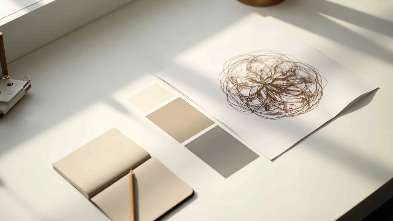
Fractal design: what it is and how to use it in visual work
A packaging mockup sits on a screen, and the same curl that frames the corner of the box also appears, smaller and rotated, on the product label. The designer did not draw each shape by hand. The pattern was generated by repeating a simple rule at smaller and smaller scales, then trimmed to fit the layout. That is the working idea behind fractal design: one short instruction, applied again and again, produces a structure whose detail keeps reappearing no matter how closely the viewer looks.
Fractal design is popular in branding, editorial illustration, motion graphics, and web backgrounds because it solves a real visual problem. Many natural-looking patterns, from coastlines to clouds to branching trees, do not repeat at a single scale. They show structure at the size of a city block and again at the size of a sidewalk crack. A standard tile pattern cannot do that. A self-similar system can. The trick is to know when the effect supports the message and when it simply adds noise.
This guide explains what fractal design actually is, how designers build it, where it fits inside a visual identity, and where it tends to fail. It is written for studio teams, in-house designers, and founders who want to decide whether a self-similar system belongs in their next project. The math behind fractals is well documented in the Wikipedia entry on fractals, so this article focuses on the working side: briefs, generators, file hygiene, brand fit, accessibility, and the practical limits that show up on a real deliverable.
What fractal design means in practice
In a studio context, fractal design refers to a visual system built from a rule that repeats across scales. The rule can be a geometric transformation, a recursion in code, or a hand-drawn motif that is redrawn at a smaller size inside its own shape. The signature property is self-similarity: a portion of the result resembles the whole.
Designers rarely use the strict mathematical version with infinite detail. They use a controlled version. A motif is chosen, a recursion depth is set, and the output is exported, simplified, and rebuilt as editable vectors. The interesting decisions happen in that translation step, because the raw fractal is usually too dense, too busy, or too uniform to ship directly.
Three terms come up often in briefs and tools:
- Self-similarity. A part of the pattern looks like a smaller copy of the whole. In strict fractals this is exact; in design work it is usually approximate.
- Iteration. The number of times the rule is applied. More iterations create more detail, and usually more visual weight.
- L-system. A grammar of symbols, popular in plant and branch shapes, where each symbol is rewritten as a longer string over several passes.
None of these terms are required to use fractal design well, but a working vocabulary helps when a brief mentions recursion depth, generator seed, or branching pattern and the team needs to estimate effort.
How a fractal pattern is actually built
The pipeline looks similar whether the output ends up on a tote bag or a landing page. The differences are in the cleanup steps and the constraints of the final medium.
Choosing a generator and a rule
Designers start with a generator, which is the basic shape or transformation that will be copied and scaled. Common choices include a triangle used to build a Sierpinski pattern, a line segment used to build a fern, or a vector shape that shrinks and rotates inside its own outline. The choice of generator decides the character of the result: triangles feel architectural, branching shapes feel organic, and overlapping circles feel atmospheric.
Software matters less than the rule. Chaotica and Apophysis are common for flame fractals, Inkscape handles recursive vector patterns, and code environments such as Processing or p5.js give the most control. The output is rarely a finished asset. It is raw material.
Setting iteration depth and resolution
Iteration depth is the single most important dial. Two or three passes produce simple, readable geometry. Five or six passes produce dense, painterly textures. Eight or more passes often produce a field of noise with little readable structure at the final print size.
Resolution also has to be planned early. A fractal that looks clean on a 4K monitor can turn muddy at sticker size because the smallest features compress into a gray block. Designers usually export at the largest size the medium needs and then test at the smallest size that will appear in production, for example a favicon or a pattern repeat swatch.
Cleaning and rebuilding as vector
This is the unglamorous part of fractal design. The raw output is simplified, often using a tool like Inkscape’s vectorize function, then rebuilt so each shape can be colored, spaced, and aligned. Brand colors replace the default gradient. A single rule is swapped in for accidental noise. The result is a pattern that still feels fractal but is editable inside a normal design file.
A useful test is to zoom the rebuilt pattern to 10 percent on screen. If the texture still reads as a pattern and not as a smudge, it will probably survive print and motion work. If it dissolves into noise, the design needs fewer iterations or a different generator.
Where fractal design fits in a visual identity
A self-similar system is rarely the whole identity. It works best as a supporting element with a clear role. The most common roles in branding are texture, motif, and structural background.
Texture and surface decoration
For additional context, Fractal textures are useful when a brand wants a sense of depth without literal imagery. Background fills on web headers, packaging interiors, and editorial covers benefit from a pattern that holds up at different scales. A conference banner looks detailed from ten meters away, and a name badge uses the same pattern at a fraction of the size without losing identity.
The risk is overuse. A dense fractal across a full page competes with type and product imagery. Most teams solve this by limiting the pattern to one zone per layout, or by reducing its contrast against the background.
Motif and brand mark
Some marks are built as a single iteration of a fractal rule, then frozen. A snowflake-style mark, a branching icon, or a leaf that contains a smaller leaf inside its own outline can act as a recognizable symbol without the full system behind it. The mark is the visible signature; the system lives in a guideline that explains how the same rule extends to icons, dividers, and background fills.
This is where a studio’s visual identity work tends to start, because the same rule has to carry the logo, the icon family, and the supporting graphics without looking like three different styles.
Structural background and motion
On the web, fractal design is most often used as a structural background: a hero section, a section divider, or a loading state. Generative or animated fractals work well here because the user is expected to scroll past, so the detail is appreciated in short bursts rather than studied. The pattern gives the page a sense of scale and depth that flat color cannot.
For motion, a slowly rotating or breathing fractal can replace stock video on a hero without the licensing cost. The performance budget matters: a heavy fractal animation on mobile can drop a page below usable frame rates, which is why most teams ship a static frame on small screens and reserve the animation for desktop.
A practical workflow from brief to delivery
The following steps describe a working production flow. Not every project needs every step, but skipping the cleanup usually shows up later as inconsistency between the pattern on a hero, a business card, and an email signature.
- Define the role. Decide whether the pattern is a texture, a motif, or a structural background. The role decides the rest of the brief.
- Pick the generator and the rule. Choose a generator that matches the brand tone: triangles for architectural, branches for organic, circles for atmospheric.
- Generate several candidates. Run the rule at two or three iteration depths, and at three or four seeds. Keep the ones that read cleanly at the smallest production size.
- Select and simplify. Edit the chosen pattern so it can be colored, aligned, and stored as a reusable asset. Remove accidental noise that the generator introduced.
- Test on real surfaces. Place the pattern on the actual deliverables: a web hero, a tote, a slide template. Check the smallest and largest sizes it will appear at.
- Document the rule. Add a short note to the brand guidelines that explains the generator, the iteration depth, and the colors. Future designers need to know how to extend the system, not just copy one image.
Common formats and where they break
Fractal design behaves differently across media. The table below lists the most common formats, what they are good at, and the failure mode that catches teams by surprise.
| Format | Best use | Common failure |
|---|---|---|
| Raster (PNG, JPG) | Photographic textures, mood imagery, social media stills | Becomes blocky when scaled beyond export size, especially on retina screens |
| Vector (SVG, AI, PDF) | Logos, icons, packaging, large print, responsive web | File size grows fast if iterations are not simplified, which slows web rendering |
| Generative code (Canvas, WebGL) | Animated heroes, interactive backgrounds, data-driven systems | Heavy CPU and GPU cost on low-end devices, accessibility concerns for motion |
| 3D render | Hero illustrations, product motion, broadcast loops | Long render times and high memory use, which limits iteration speed |
Most production systems end up using a vector for the static brand assets and a generative version for the web, with the same rule expressed in both. The two outputs look related because they share a rule, not because a designer redrew one in the style of the other.
Brand fit: when self-similarity helps and when it does not
Fractal design is not a neutral choice. It signals something about the brand, even when no one on the team intended the signal. A dense, branching pattern tends to read as organic, scientific, or mathematical. A repeating triangle field reads as architectural or technical. A spiral read reads as dynamic or cosmic. The signal is real, and it should be planned.
The pattern also competes with photography. If a brand relies on portrait photography to carry emotion, a fractal background will fight the faces. If a brand relies on product photography with clean edges, a fractal texture can soften the product in a useful way, the way a textured card stock softens a print.
For additional context, There are also brands where fractal design is the wrong tool. A legal services firm that needs to project calm precision usually wants flat, structural geometry rather than self-similar noise. A children’s brand that wants a single friendly mascot usually wants one drawn shape, not a generated system. The pattern has to fit the message, not the trend.
Accessibility and performance considerations
Two practical issues come up in almost every project that uses fractal design: visual accessibility and runtime cost. Both have known solutions, and both are easier to address in the brief than in a redesign.
Contrast and readability
Fractal textures are visually busy by nature, which makes text placed over them harder to read. The standard guidance is to keep the contrast between text and background at WCAG AA, which is 4.5:1 for body text and 3:1 for large text. In practice, designers either fade the pattern to the bottom of the page, place a solid color panel behind the text, or blur the pattern where the text sits.
Color choice matters too. Patterns built from similar hues tend to look softer but also hide type outlines. Patterns built from high-contrast colors look crisp but tire the eye faster on long pages. A useful rule is to test the pattern on a real article, with real type at real size, and ask a non-designer to read it for thirty seconds.
Motion and vestibular sensitivity
Animated fractals can be a problem for users with vestibular disorders. A pattern that pulses, zooms, or rotates slowly can trigger symptoms even when the motion looks subtle to the designer. Most teams solve this with a prefers-reduced-motion media query that swaps the animated version for a static frame. This is the same pattern used for other types of motion, and it fits inside the broader accessibility practice a studio already follows.
File weight and rendering
A dense vector fractal can be larger than a flat illustration, and a generative version can be heavier than a still image. Both add to the page weight that the user has to download. The simplest checks are: export the smallest file that still reads at the smallest size, and load any animated version only after the page has settled. Lazy loading and the loading=”lazy” attribute are useful here, as is serving a lower-cost version to mobile users.
Comparing fractal design with other pattern systems
Fractal design sits between two more familiar approaches: a single repeated tile and a fully generative AI image. The table below compares the three on the points that usually decide a brief.
| Property | Repeated tile | Fractal design | Generative AI image |
|---|---|---|---|
| Control over output | High, every shape is editable | Medium, rule controls output, cleanup still required | Low, prompts steer but do not pin the result |
| Scale flexibility | Limited, repeat becomes visible | High, the same rule holds at different sizes | High in theory, often inconsistent in practice |
| File weight on the web | Low | Medium to high | High |
| Brand system fit | Easy to document | Easy to document if the rule is simple | Hard to document, each output is unique |
| Accessibility | Predictable | Needs care around contrast and motion | Needs care around contrast and motion |
| Cost over time | Low, one tile, many uses | Medium, rule and cleanup | Variable, prompts and revisions |
The choice between these systems is rarely aesthetic. It is about control. A team that needs the same pattern to behave on a 5 mm label and a 5 m banner usually picks a tile or a fractal. A team that needs a one-off hero image for a campaign usually picks an AI image. A team that needs the pattern to be a permanent part of the brand usually picks a fractal, because the rule can be reused, edited, and extended over years.
Briefs that produce useful fractal design
The briefs that go well share a few traits. They name the role of the pattern, the surfaces it will appear on, the smallest and largest sizes, and the colors it must respect. They also name what the pattern should not do, such as competing with photography or appearing on forms.
A simple template:
- Role: texture, motif, or structural background.
- Surfaces: web hero, packaging, slide template, social stills.
- Size range: smallest pixel size to largest physical size.
- Palette: two to five colors, with hex values.
- Exclusions: no type, no human faces, no product photos behind it.
- Constraints: file size limit on the web, print profile for paper, motion sensitivity rules.
This list is short on purpose. A fractal design brief is easier to deliver when the constraints are clear, and a rule is easier to control when the rule has fewer things to satisfy.
Common mistakes in fractal design projects
The same issues show up across projects. Naming them up front helps a team avoid them.
- Skipping cleanup. The raw fractal is shipped because the deadline is short. The result looks fine in isolation and noisy next to the rest of the brand.
- Using one pattern everywhere. A single fractal is asked to be a hero, a divider, a background, and an icon. The pattern loses its sense of scale and starts to feel like a wallpaper.
- Forgetting the smallest size. The pattern looks great on a 27-inch screen and dissolves on a phone lock screen because the smallest features fall under a pixel.
- Ignoring motion preferences. An animated version goes live without a reduced-motion fallback, which excludes a real group of users.
- Skipping the documentation. The rule lives in one designer’s head, and the next designer redraws a similar-looking pattern that does not actually share the rule.
None of these mistakes is fatal. Each one is a normal outcome of working under time pressure, and each one has a small fix that costs less time than the original mistake.
How fractal design connects to the rest of a brand
A self-similar system is most useful when it connects to the rest of the brand through shared rules, not shared shapes. The same color rules that govern the type should govern the pattern. The same spacing scale that spaces paragraphs should space fractal elements. The same icon stroke width should match the weight of the fractal lines.
This is where fractal design earns its place in a visual identity system. The system is the rule set, and the fractal is one expression of that rule set. If the rule set is solid, the fractal can be retired and replaced with a new pattern generated by the same logic, and the brand will still feel like itself.
For teams that are still building the rule set, it is worth deciding the pattern last, not first. The pattern is a strong visual gesture, and a strong gesture on a weak foundation tends to look like decoration. The pattern, the type, the color, and the motion guidelines are stronger when they are designed to work together, even if only one of them happens to be a fractal.
Frequently asked questions
What is fractal design in simple terms?
Fractal design is a visual system built from a rule that repeats across scales. A small part of the result looks like a smaller version of the whole, which is why the same pattern can hold up at the size of a favicon and the size of a banner without losing its structure.
Do I need to know math to use fractal design?
No. Most designers work with tools that handle the math and adjust settings such as iteration depth and seed. The useful knowledge is editorial: how to pick a rule, how to clean the output, and how to test it on real surfaces.
What software is best for fractal design?
For static brand work, vector tools such as Inkscape, Illustrator, or Affinity Designer are the most useful because the output is editable. For flame and palette fractals, Chaotica and Apophysis are common. For web and motion, Processing, p5.js, or WebGL give the most control. The choice depends on the medium, not the math.
Can fractal design work for a small business brand?
Yes, but it works best when the role is clear. A small business usually benefits more from a single motif built from a fractal rule than from a full generative system. The motif is a recognizable shape, the rule is a small note in the guidelines, and the system can grow later if the brand needs more textures.
Is fractal design the same as generative AI art?
No. Fractal design uses a defined rule that produces a predictable family of results, which is why the output can be documented and reused. Generative AI produces images from training data and prompts, which is harder to pin down and harder to keep on brand. Both have their place, but they answer different briefs.
How do I keep a fractal design accessible?
Three checks cover most cases. Keep contrast between type and the pattern at WCAG AA. Replace any animated version with a static frame for users who prefer reduced motion. Test the pattern at the smallest size it will appear in production, and remove detail that does not survive.
What file format should I export for web use?
For static brand patterns, SVG is usually the right choice because the file stays sharp at any size. For textures, a high-resolution PNG or a compressed WebP works well. For animated versions, a small generative script that runs in the browser is often lighter than a video file, and it can respect the user’s motion settings.
How many iterations should a fractal pattern use?
It depends on the smallest size the pattern will appear at, not the largest. Two to three iterations are enough for simple, readable geometry. Four to six iterations are useful for textures and editorial backgrounds. More than that usually produces noise at the small end of production.
Can fractal design replace a logo?
It can act as a mark, but a mark usually needs to be readable at very small sizes and in one color, which a fractal often is not. A more common approach is to use a single iteration of a fractal rule as the mark, then keep the full system for supporting graphics.
What should I put in a brand guideline for a fractal pattern?
A short note that covers the rule, the generator, the iteration depth, the colors, the smallest size it can be used at, and the surfaces where it should not appear. Future designers can extend the system from that note without guessing what the original team intended.